 Free Shipping Over $50
  888-432-8363


 Obituary/Programs
 No-Fold Memorial Programs
 4 Page Funeral Programs
 8 Page Memorial Programs
 12 Page Funeral Programs
 16 Page Funeral Programs
 20 Page Funeral Programs
 Tri-Fold Funeral Programs
 Complete Memorial Packages
 Cards & Bookmarks
 Saint Prayer Cards
 Folded Memorial Cards
 Folded Holy Cards
 Memorial Bookmarks
 Thank You Cards
 Share-A-Memory Cards
 Memorial Magnets
 Memorial Posters
 Guest Books
 Slide Shows
 Memorial Fans
 Death Announcements
 Take Away Keepsakes
 Church Products
Introduction: Honoring Loved Ones with Accessible Memorial Programs
During times of loss, the act of creating a memorial program is both a tribute and a comfort—a tangible way to honor cherished memories and share them with family and friends. At DisciplePress, we deeply understand that every detail matters, especially when it comes to ensuring these keepsakes are welcoming and easy to read for everyone. Grief can make even simple tasks feel overwhelming, and trying to balance beauty with readability may feel daunting. Many families worry about making sure elderly guests, those with visual impairments, or anyone reading through tears and emotion can find comfort in the printed words.
That’s why “accessible fonts and colors for memorial programs” is not just a design consideration—it’s a compassionate choice. Selecting the right fonts and color combinations can make a significant difference, ensuring that your bi-fold programs, memorial cards, and celebration of life programs are inclusive and supportive of every attendee. Accessibility in memorial printing is about more than aesthetics; it’s about creating clarity, warmth, and connection for all who gather to remember.
In this article, we’ll gently guide you through the essential aspects of accessible fonts and colors for easy-to-read memorial programs. We’ll explore practical tips for font selection, color contrast, sizing, and layout that help maximize readability for everyone, including those with aging eyes or visual challenges. We’ll also offer real-world examples, helpful ideas, and reassurance that you’re not alone in these decisions.
We know this journey can be difficult, and it’s our hope that the information ahead will provide both comfort and confidence as you make thoughtful choices. Whether you’re planning a simple prayer card, a multi-page booklet program, or unique keepsakes like memorial bookmarks, we’re here to help you honor your loved one in the most accessible and heartfelt way possible.
The Importance of Accessibility in Memorial Printing

When we gather to remember a loved one, we come together across generations, cultures, and abilities. Memorial programs, whether they are 8-page programs or elegant tri-fold programs, serve as a guide and a keepsake—offering comfort through shared readings, photos, and memories. Ensuring these programs are accessible to all is a reflection of the care and respect we wish to extend to every guest.
Every memorial should reflect the unique life and legacy of your loved one. We offer Memorial Bookmarks, Funeral Programs and Prayer Cards to help you create meaningful tributes.
Accessibility means creating designs that can be easily read and understood by people of all ages and visual abilities. For many families, this includes considering the needs of elderly attendees, whose eyesight may be less sharp, as well as those with conditions like color blindness or low vision. Choices in font style, size, and color contrast directly impact how easily someone can engage with the content, from the order of service to treasured poems or scripture passages.
Inaccessible designs can unintentionally exclude or frustrate attendees. Small print, ornate fonts, or low-contrast color schemes might look beautiful—but if they’re difficult to decipher, they can cause unnecessary stress or even prevent someone from participating fully in the ceremony. When planning funeral programs or memorial cards, it’s helpful to ask: “Will everyone be able to read and find comfort in these words?”
At DisciplePress, we believe accessible design is an act of compassion. Whether you choose our custom design services or use our obituary templates, we encourage you to make inclusivity a priority. In the sections that follow, we’ll share practical, gentle guidance to help you select accessible fonts and colors for memorial programs that honor every guest’s experience.
Choosing Accessible Fonts: Clarity, Simplicity, and Warmth
The first step toward accessible memorial programs is selecting the right font. Font choice has a profound impact on readability, especially for elderly eyes or those with visual challenges. Simple, clear fonts help ensure that every cherished memory, name, and detail is easily seen and understood.
Sans-serif fonts, such as Arial, Calibri, or Verdana, are often recommended for easy reading. Their clean lines and open shapes minimize confusion between similar-looking letters. For example, the difference between a lowercase “l” and uppercase “I” is much clearer in these fonts than in ornate scripts. Serif fonts like Times New Roman can also be accessible if used in larger sizes and with adequate spacing.
Ornamental or calligraphic fonts may be tempting for headings or names, as they often convey elegance or solemnity. However, these should be used sparingly and never for body text. If you wish to use a decorative font for a name or title, pair it with a simple, readable font for the main text. For example, in an 8-page program, use a script font for the cover title, but a sans-serif for the order of service and obituary.
When creating your program—whether it’s a booklet program, memorial bookmarks, or prayer cards—choose one or two fonts at most. Limiting font variety helps maintain a sense of calm and order, which is especially comforting during emotional times. If you need help pairing fonts, DisciplePress offers custom design services and a design gallery to inspire thoughtful selections.
Font Size and Spacing: Ensuring Readability for All Ages
Even the most accessible font can become difficult to read if it’s too small or tightly spaced. Many older adults and those with limited vision struggle with standard print sizes, especially in low light environments often found in churches or funeral homes. Choosing appropriate font size and spacing is a simple but powerful way to demonstrate care for every attendee.
DisciplePress is dedicated to helping families honor their loved ones with dignity and care. We offer Prayer Cards, Memorial Cards and Obituary Templates to help you create meaningful tributes.
For body text in funeral programs and memorial cards, a minimum of 12-point font is recommended, with 14-point or larger being ideal for elderly guests. Headings and section titles should be at least 16-18 points to create clear visual hierarchy. On larger formats like 16-page or 20-page programs, you have more space to use even larger print for special sections or prayers.
Line spacing (also known as leading) should be generous—typically 1.2 to 1.5 times the font size. Adequate spacing between lines and paragraphs prevents text from appearing crowded, which reduces eye strain and helps readers keep their place. Ample margins and white space around the text further enhance clarity.
For keepsakes such as memorial bookmarks or folded memorial cards, you may be working with smaller surfaces. In these cases, prioritize clarity over fitting in extra text. Consider using larger formats, like large memorial cards or 4×6 prayer cards, if important information needs to be legible for all. If you’re unsure about sizing, our team at DisciplePress can guide you or provide rush orders for last-minute adjustments.
Color Contrast: The Key to Legibility
Color contrast is essential to ensuring text does not disappear into the background, especially for those with visual impairments or color blindness. High-contrast combinations make reading effortless, while low contrast can obscure even the most heartfelt tribute. When choosing accessible fonts and colors for memorial programs, contrast should always be a top consideration.
The most accessible option remains classic: dark text on a light background, such as black type on white or cream paper. This combination provides the greatest legibility and is suitable for bi-fold programs, memorial cards, and funeral guest books alike. If you wish to use colored backgrounds—perhaps to reflect a loved one’s favorite hue—ensure the text color is several shades lighter or darker than the background for maximum clarity.
When using colored headings or decorative elements, always check their visibility against both the background and the body text. Avoid using light gray or pastel text, as these can fade under overhead lighting or appear washed out in printed materials. For celebration of life programs that often feature vibrant themes, maintain a strong contrast between text and color blocks; for example, navy blue text on a pale yellow background.
For those with color blindness, certain color pairs (like red and green) can be difficult to distinguish. Use online contrast checkers to preview your chosen palette, or ask our custom design services team for suggestions. When in doubt, prioritize simplicity and contrast—this ensures everyone, regardless of ability, can participate fully in the memorial experience.
Inclusive Design for Visual Impairments: Thoughtful Details
Beyond font and color, several additional design choices can make your memorial programs more welcoming for those with visual impairments. These thoughtful touches show deep respect for every guest, ensuring the service is open and comforting to all. Consider these practical steps when designing your program, whether it’s a tri-fold program, an 8-page program, or a keepsake such as a memorial candle insert.
First, avoid using all-uppercase text for body copy. While uppercase letters may seem attention-grabbing, they are actually more difficult to read in large blocks, particularly for dyslexic readers or those with low vision. Reserve all caps for short headings if desired, but keep most text in sentence or title case.
Second, use bullet points or numbered lists to organize information in order of service or reception details. This breaks up dense text and helps readers quickly find what they need. In longer booklet programs, such as 16-page or 20-page formats, consider adding page numbers and clear section headings throughout.
Third, select paper finishes that minimize glare. Glossy paper can reflect light and make text hard to see, especially for those with cataracts or macular degeneration. Choosing a matte or uncoated paper stock can improve readability. For guidance on paper options, our paper types guide offers helpful information, or you can contact us directly for recommendations tailored to your needs.
Lastly, if you’re including photos or artwork, ensure they don’t interfere with text. Place text over solid color blocks rather than images, or use a subtle overlay to maintain contrast. Our design gallery features examples of accessible layouts that balance beauty with clarity, and our team is always ready to help with custom design services or same-day printing for urgent needs.
Practical Examples: Designing for Accessibility Across Memorial Products
Every memorial product—from classic funeral programs to unique keepsakes like memorial bookmarks—presents its own design challenges and opportunities. Ensuring accessibility across formats means gently adapting your choices while retaining the warmth and dignity each piece deserves.
For bi-fold programs, the most common memorial format, start with a clean, simple layout. Use a 14-point sans-serif font for the order of service, with bold, high-contrast section headings. Include generous margins and avoid overcrowding pages with too much information. If you need to include additional tributes or readings, consider moving to an 8-page or 12-page program for more space without sacrificing legibility.
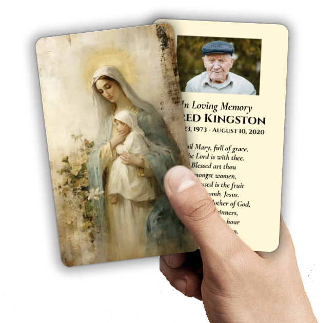
Prayer cards and memorial cards often feature cherished prayers, poems, or photographs. Given their small size, prioritize the most meaningful text and use at least a 12-point font. Opt for dark text on a pale background, and avoid placing text directly over images. If you wish to include a saint prayer or Bible verse, consider using a slightly larger card, such as a 4×6 prayer card, to ensure readability.
Memorial bookmarks are treasured keepsakes that guests will revisit long after the service. Keep design minimal, with a single, heartfelt message in a clear font (14-point or larger) and high-contrast colors. For those ordering large memorial cards or celebration of life programs with vibrant themes, select color palettes with strong contrast and avoid ornate fonts for the main text. Our custom design services can help adapt any product for accessibility, whether you need rush orders or tailored adjustments to suit your family’s needs.
Working with Professional Printers: Ensuring Accessibility from Start to Finish
Partnering with a compassionate, experienced printer like DisciplePress can make the process of creating accessible memorial programs much easier during a difficult time. Our team understands the emotional weight of these decisions, and we’re dedicated to supporting families, funeral directors, and community leaders through each step.
When you reach out to us for custom design services or to order bi-fold, tri-fold, or booklet programs, we’ll gently guide you through accessible font and color choices. We can provide samples or digital proofs, so you can review how your selections will appear in print. If you’re uncertain about color contrast or font size, our designers can make recommendations based on best practices and real-world feedback from families.
Time is often of the essence when planning a funeral or memorial service. Our same-day printing and rush order options mean that you can make adjustments for accessibility—even at the last minute—without sacrificing quality or comfort. We’re also happy to consult on related products, such as memorial cards, bookmarks, and thank you cards, to ensure a cohesive and accessible set of keepsakes.
Clear communication is at the heart of our process. If you have specific accessibility needs—such as accommodating guests with low vision, color blindness, or other challenges—please contact us. We’ll work with you to create programs and keepsakes that truly honor your loved one, ensuring every detail is readable, comforting, and dignified.
Related Articles
Conclusion: Creating Comfort and Connection Through Accessible Memorial Programs
In times of loss, the simple act of making memorial programs accessible is a profound gesture of love and care. By choosing accessible fonts and colors for memorial programs, you ensure that every guest—including elderly attendees and those with visual impairments—can share in remembrance and find comfort in the printed words.
We’ve explored the importance of clear font choices, appropriate sizing and spacing, high-contrast color combinations, and thoughtful design adaptations for visual impairments. Each of these steps, from selecting a readable font for bi-fold programs to choosing glare-free paper for memorial bookmarks, is an opportunity to express compassion and inclusivity.
As you navigate this emotional journey, remember that you’re not alone. At DisciplePress, we offer a wide range of products—from 8-page programs and memorial cards to custom design services and same-day printing—to help ease the burden and honor your loved one’s legacy in the most accessible way possible.
If you have questions or need personalized support, please reach out to us. Our team is here to help with every detail, providing gentle guidance, practical resources, and a listening ear. Together, we can create memorial printing that brings comfort, clarity, and connection to all who gather in remembrance. Learn more about DisciplePress and our commitment to serving families. Browse our design gallery for inspiration. For personalized assistance, please contact us.