 Free Shipping Over $50
 888-432-8363



 Obituary/Programs
 No-Fold Memorial Programs
 4 Page Funeral Programs
 8 Page Memorial Programs
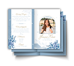 12 Page Funeral Programs
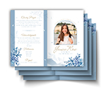 16 Page Funeral Programs
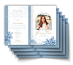 20 Page Funeral Programs
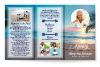 Tri-Fold Funeral Programs
 Complete Memorial Packages
 Cards & Bookmarks
 Saint Prayer Cards
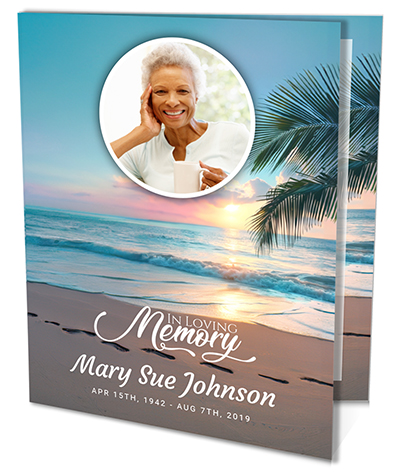 Folded Memorial Cards
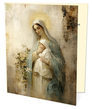 Folded Holy Cards
 Memorial Bookmarks
 Thank You Cards
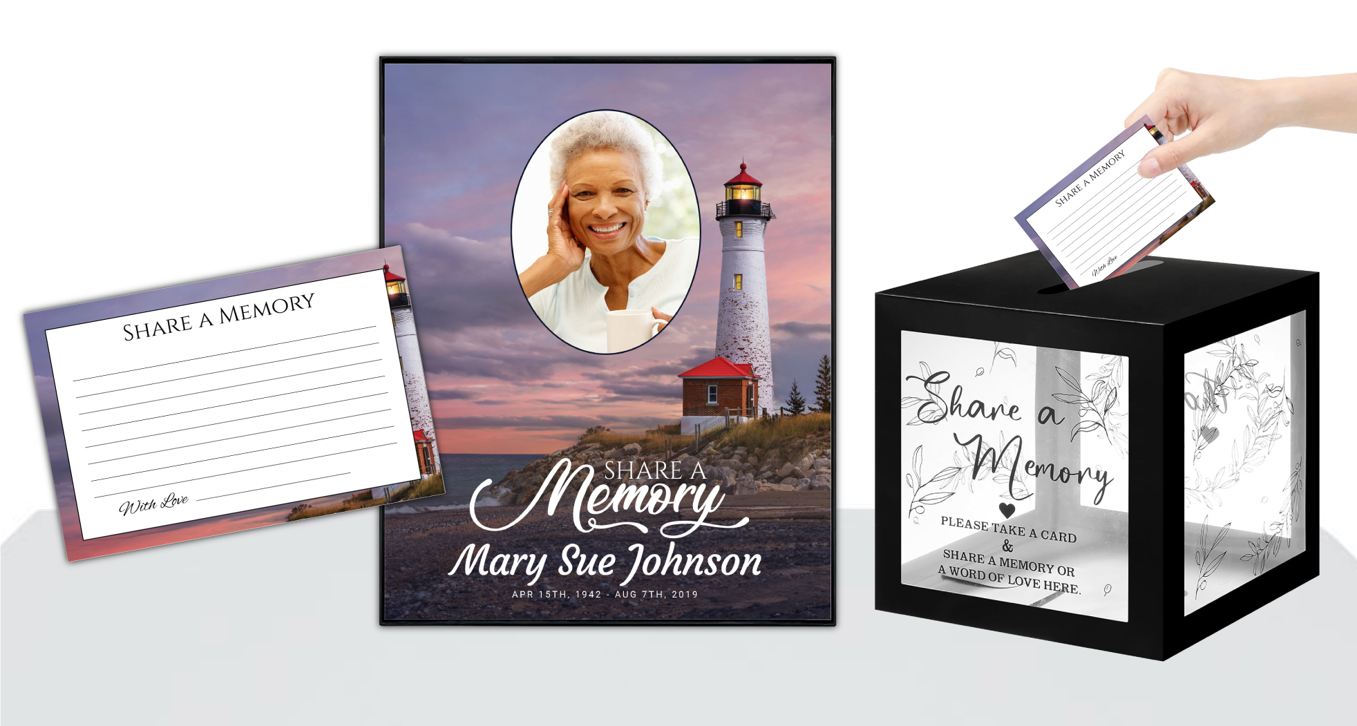 Share-A-Memory Cards
 Memorial Magnets
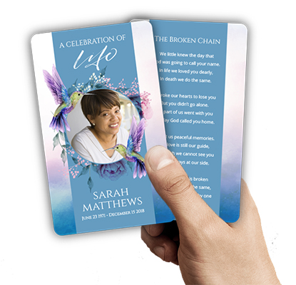
 Memorial Posters
 Guest Books
 Slide Shows
 Memorial Fans
 Death Announcements
 Take Away Keepsakes
 Church Products
Finding Comfort and Clarity: Why Fonts and Colors Matter for Church Stationery
In times of loss, transition, or even joyful celebration, church correspondence often becomes a lifeline—conveying not just information, but care, unity, and compassion. For grieving families, funeral directors, and ministry leaders, the details of church stationery can feel overwhelming amid emotional moments. Yet, the choices made in design—especially the best fonts and colors for church stationery—play a crucial role in communicating warmth and professionalism. These design elements quietly but powerfully reflect your church’s values and the care you extend to every recipient.
Thoughtfully chosen fonts and colors can provide a sense of stability and reassurance. A well-designed letterhead on donation receipts or thank you letters communicates gratitude and orderliness, comforting families who may feel adrift. For ministry correspondence, the right combination of typeface and color palette can foster trust and present your message in a clear, inviting way. Every detail, from the subtlety of a soft blue to the dignity of a classic serif font, supports emotional connection and ministry outreach.
This article is dedicated to helping you navigate these choices with confidence. We understand the sensitivity required when creating materials that may accompany prayer cards, memorial bookmarks, or formal thank you notes. Whether you’re preparing bi-fold programs for a funeral service or sending out church invite cards, the guidance here will ensure your stationery honors both your mission and your message.
We’ll explore specific, actionable advice on the best fonts and colors for church stationery and letterhead. You’ll find real-world examples, practical tips, and gentle suggestions tailored to ministry settings. Our goal is to lighten your burden, answer your questions, and support you in creating correspondence that feels as compassionate as your intentions.
The Power of Fonts: Choosing Styles That Reflect Ministry Values
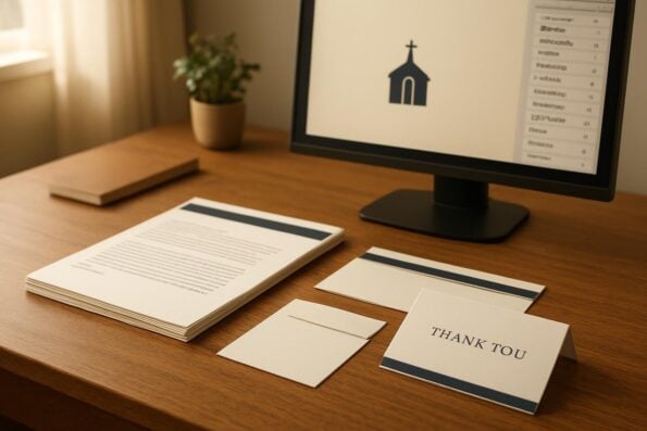
Fonts are the voice of your written communication—they set the tone before a single word is read. For church stationery and letterhead, the choice of font can express reverence, approachability, and even hope. Serif fonts, such as Times New Roman, Georgia, or Garamond, are timeless choices that bring an air of tradition and formality, making them suitable for official letters and donation receipts. Their classic style reassures recipients of the church’s stability and respect for tradition.
Sans-serif fonts like Arial, Calibri, and Helvetica offer a modern, clean look. These are ideal for ministry newsletters, event invitations, or informal communication. Their simple lines create a welcoming and accessible appearance, which can be especially comforting in thank you letters or connection cards. For instance, a bi-fold program using Calibri for headings and Georgia for body text can beautifully balance clarity and tradition.
Script and calligraphy-style fonts, such as Great Vibes or Pacifico, can add a personal, heartfelt touch when used sparingly—perhaps in a signature or a Bible verse heading. However, it is important to avoid using script fonts for large blocks of text, as they may reduce readability, especially for older recipients or those in distress. Instead, reserve these decorative fonts for titles or emphasis in memorial cards or prayer cards.
When selecting fonts for church letterhead, legibility should always come first. Choose a font size that is easy to read, typically 10 to 12 points for body text, and ensure there is enough spacing between lines. Consider testing your chosen font by printing a sample letter on your preferred paper type before finalizing your design. Our custom design services can help you try different combinations to see what best fits your congregation’s needs.
Color Choices That Communicate Compassion and Trust
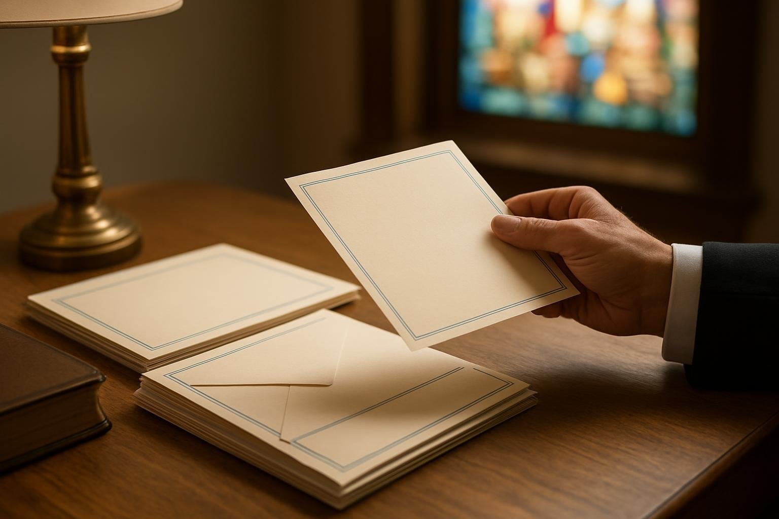
Color is more than decoration—it shapes emotional response and perception. For church stationery, the best colors are those that impart calm, hope, and trust without overwhelming the message. Soft neutrals, such as ivory, cream, or pale gray, provide a gentle background that highlights your text while feeling inviting and dignified. These shades are especially fitting for funeral programs, memorial bookmarks, and formal ministry communications.
Blue is a universally trusted color, symbolizing faith, serenity, and stability. Light blues can be used in headers, borders, or accents to bring a sense of peace, while deeper blues add gravitas to official letters or donation receipts. Green, representing renewal and growth, is another excellent choice for ministry correspondence. Subtle sage or olive accents can reflect the church’s message of hope and continuity, especially in celebration of life programs or church bulletins.
For more joyful occasions—such as thank you cards or invitation letters—gentle pastels like lavender, blush, or soft gold can add a touch of warmth without distracting from your message. However, it’s important to avoid overly bright or saturated colors, which may feel jarring or out of place in sensitive contexts. Earth tones and muted shades are generally safer, particularly for memorial cards or church letterhead intended for solemn events.
When pairing colors with fonts, ensure high contrast for readability. Dark gray or navy blue text on a light background is easier on the eyes and maintains a professional look. DisciplePress offers a range of paper types and printing options, so you can preview how your color choices will appear in print. If you are unsure, our custom design services can provide guidance on choosing harmonious color palettes to reflect your church’s identity.
Combining Fonts and Colors for Different Ministry Communications
Different types of church correspondence call for distinct combinations of fonts and colors. Donation receipts, for example, benefit from formal serif fonts in navy or charcoal, paired with a subtle border in a soft blue or green. This creates a sense of trust and financial integrity, reassuring donors that their gifts are valued and handled with care. For official letters, a combination of Georgia or Times New Roman with understated gold or burgundy accents conveys both dignity and gratitude.
Thank you letters and connection cards offer an opportunity to be a bit more personal. Consider using a clean sans-serif font like Calibri or Arial for the body, with a gentle pastel accent—perhaps a lavender border or a sage green header. Adding a small, tasteful script font for your closing or signature can lend a heartfelt touch. Products like our folded memorial cards or prayer cards can also benefit from this approach, balancing clarity with warmth.
Ministry correspondence often includes invitations, announcements, and informational letters. Here, clarity and approachability are key. Use simple sans-serif fonts in dark gray or deep blue for maximum legibility, and add visual interest with a muted color block or banner. For example, a tri-fold program might use Helvetica in navy blue, with an accent line in light gold to highlight important details. This combination guides the reader’s eye and elevates the overall presentation.
When working with DisciplePress, you can upload print-ready artwork or collaborate with our design team to create personalized stationery that fits each occasion. Remember, consistency across your stationery—using the same fonts and color palettes for church letterhead, envelopes, and thank you cards—helps reinforce your church’s identity and fosters a sense of belonging among recipients.
Practical Tips for Readability and Accessibility
Ensuring your church stationery and letterhead are accessible to all recipients is a vital act of ministry. Readability can be impacted by font choice, size, color contrast, and layout. Always select fonts that are easy to read at a reasonable size—ideally 10 to 12 points for body text, and 14 to 16 points for headings. Avoid overly decorative or condensed fonts, as these can be difficult for older adults or those with visual impairments.
Color contrast is equally important. A dark font on a light background is generally the easiest to read. If you wish to use colored backgrounds, ensure your text color stands out clearly. For example, white or cream text on a deep blue or green background can be effective for headings but may be harder to read for longer passages. When in doubt, print a sample and ask members of different ages to review it for comfort and clarity.
Spacing and alignment also play a role in readability. Use generous margins and line spacing to avoid a crowded appearance. Left-aligned text is usually the easiest for the eye to follow, especially in longer letters or program notes. For memorial cards or bookmarks, choose layouts that allow key information and names to stand out, avoiding the temptation to fit too much on a single card.
DisciplePress offers a range of formats—such as bi-fold, tri-fold, and booklet programs—that can be tailored for accessibility. If you’re in need of rush orders or same-day printing, our team can help ensure the final product is as readable as it is beautiful, even under tight timelines. We encourage you to ask about our accessibility options when preparing your next order.
Building Emotional Connection Through Thoughtful Design
Every piece of church stationery is an opportunity to express care and solidarity. The right combination of fonts and colors can evoke feelings of comfort and belonging, especially when words may be hard to find. For example, a thank you card sent after a memorial service, designed in soft earth tones with a gentle serif font, can bring solace to grieving families and remind them of the church’s ongoing support.
Adding subtle religious symbols—like a cross, dove, or olive branch—using a muted accent color can reinforce your message without overwhelming the recipient. When paired with a classic font, these design elements speak of faith and continuity. Consider using these touches on memorial bookmarks, prayer cards, or folded memorial cards to create a keepsake that families will treasure.
Personalization is another way to build connection. Including the recipient’s name in a slightly larger font, or using a script style for personal notes, helps each letter feel unique and intentional. DisciplePress’s custom design services can help you incorporate these personal touches while maintaining an elegant, cohesive look across your stationery set.
Finally, consider the emotional journey of your audience. For those receiving celebration of life programs or church invite cards, a blend of cheerful yet respectful colors—like muted golds, soft greens, or blues—can offer hope and encouragement. Every design choice, from font to color, is a gentle reflection of your ministry’s care for each individual’s story.
Consistency and Identity: Reinforcing Your Church’s Message
Consistency in your use of fonts and colors not only looks professional but also strengthens your church’s identity. Using the same primary fonts and color palette across your church letterhead, envelopes, bulletins, and thank you cards creates a recognizable, unified presence. This consistency reassures recipients that every message, whether a donation receipt or a memorial card, comes from a place of intentional care.
If your church has an established logo, match your stationery’s fonts and colors to those used in your logo. This reinforces visual identity and fosters trust. For instance, if your logo features navy blue and gold, carry these colors through to your letterhead’s border and heading fonts. DisciplePress offers church letterhead, mailing envelopes, and bookmarks that can be customized to match your existing branding.
When introducing new design elements, such as an updated font or accent color, do so gradually. Test new layouts with a small group and gather feedback on readability and emotional impact. This process ensures your changes are well-received and maintains the integrity of your church’s message.
For special occasions—like Easter, Christmas, or memorial services—you can introduce seasonal accents while keeping your core design consistent. Use a script font for a holiday greeting or a subtle pastel for an Easter program, but return to your main fonts and colors for regular correspondence. Our design gallery offers inspiration for creating both classic and seasonal stationery that fits your ministry’s needs.
Practical Examples: Font and Color Choices for Common Church Stationery
Let’s look at some specific combinations for frequently used church materials. For donation receipts, consider pairing Georgia (body text, navy) with Times New Roman (headings, dark gold accent). This combination underscores professionalism and gratitude. For thank you letters, try Arial (body, charcoal) with a soft green border and a script font (Great Vibes) for your closing signature—adding warmth while maintaining clarity.
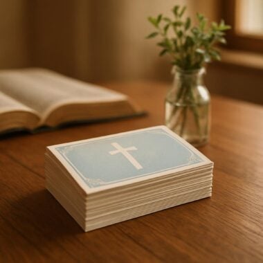
Memorial cards might use Garamond (body, deep gray) with a pale blue background and a cross motif in silver or sage. This creates a peaceful, respectful tone appropriate for both faith-based and nature-themed programs. For ministry correspondence, such as event invitations, Calibri (body, black) with an accent header in burgundy or muted gold feels welcoming and organized.
Booklet programs for funerals—such as 8-page or 12-page programs—benefit from consistent use of serif fonts for main content and a single accent color for section dividers or Bible verse headings. Using the same font and color scheme across bi-fold programs, tri-fold programs, and booklet programs reinforces cohesion and helps families feel supported through each stage of communication.
DisciplePress can help you achieve these combinations with our wide range of products and design options. If you’re pressed for time, our same-day printing and rush orders ensure you never have to sacrifice quality or care for urgency. Upload your print-ready artwork or reach out for assistance with selecting fonts and colors that best reflect your ministry’s heart.
Related Articles
Conclusion: Bringing Comfort and Clarity Through Thoughtful Stationery Design
As you navigate the details of church communication, remember that every design choice—down to the best fonts and colors for church stationery and letterhead—carries meaning. By thoughtfully selecting fonts that balance tradition with readability and colors that evoke peace and trust, you create correspondence that supports, comforts, and uplifts those you serve.
Throughout this article, we’ve explored practical strategies for combining serif and sans-serif fonts, choosing gentle color palettes, and maintaining consistency across all your church stationery. Whether you are preparing funeral programs, memorial bookmarks, prayer cards, or thank you notes, these decisions reflect your ministry’s care in every detail.
If you’re feeling uncertain, remember that you don’t have to make these choices alone. DisciplePress offers custom design services, a variety of stationery products, and compassionate support to help you create materials that truly express your church’s heart. Our turnaround time, including same-day printing and rush orders, ensures that your needs are met—even in urgent situations.
We invite you to explore our products—from bi-fold and tri-fold programs to church letterhead and envelopes—and reach out to us for guidance or inspiration. Together, we can ensure that your church’s communication brings comfort, clarity, and hope, one letter at a time.