 Free Shipping Over $50
 888-432-8363



 Obituary/Programs
 No-Fold Memorial Programs
 4 Page Funeral Programs
 8 Page Memorial Programs
 12 Page Funeral Programs
 16 Page Funeral Programs
 20 Page Funeral Programs
 Tri-Fold Funeral Programs
 Complete Memorial Packages
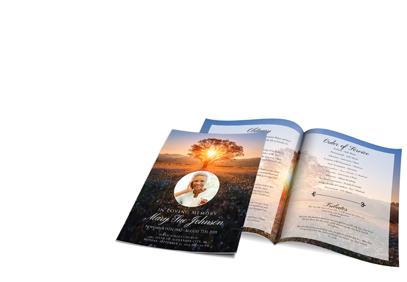
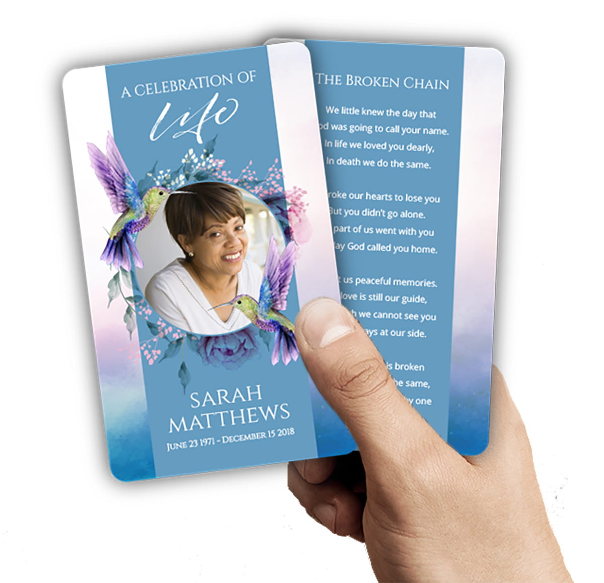 Cards & Bookmarks
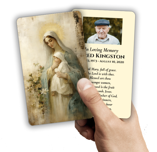 Saint Prayer Cards
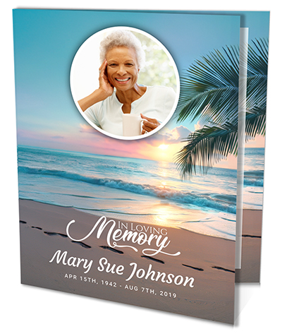 Folded Memorial Cards
 Folded Holy Cards
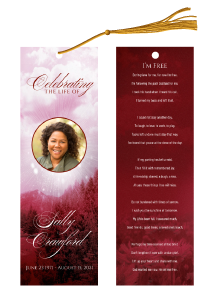 Memorial Bookmarks
 Thank You Cards
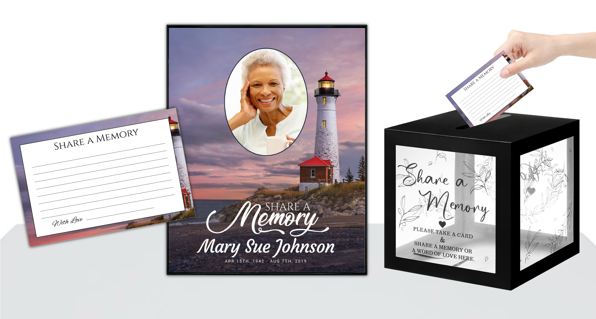 Share-A-Memory Cards
 Memorial Magnets
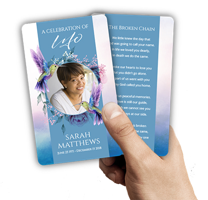
 Memorial Posters
 Guest Books
 Slide Shows
 Memorial Fans
 Death Announcements
 Take Away Keepsakes
 Church Products

Introduction: Honoring Loved Ones Through Thoughtful Font Choices
Losing a loved one is one of life’s most difficult experiences, and planning a funeral or memorial service can feel overwhelming. In these moments, every detail matters—especially when it comes to creating a memorial piece that truly honors the individual’s life and legacy. The words you include in a funeral program carry deep meaning, but the way those words are presented visually is equally important. That’s why choosing the best fonts for funeral programs is a decision that deserves gentle thought and care.
Fonts do more than just display information—they set the mood and tone of your tribute. The right typeface can bring comfort, evoke cherished memories, and help family and friends connect with the spirit of your loved one. Whether you are selecting fonts for bi-fold programs, memorial bookmarks, or prayer cards, the choice you make can subtly influence how people experience and remember the service.
In this article, we will guide you through the most suitable font styles for funeral programs, complete with specific examples, visual considerations, and practical tips. We understand that every family’s needs are unique, so we’ll discuss how to match fonts to different personalities, cultural traditions, and the atmosphere you wish to create. We’ll also offer advice for ensuring readability and emotional resonance, no matter which format you choose—from simple 8-page programs to elaborate 20-page booklets.
At DisciplePress, we believe that every memorial piece should honor your loved one in a way that feels right for you. We’re here to support you with compassionate expertise and flexible options, whether you’re designing a program yourself or using our custom design services. We hope this guide provides clarity, comfort, and inspiration as you make these meaningful decisions.
Why Font Selection Matters in Funeral Programs

Fonts aren’t just a design choice—they’re a way to communicate emotion, personality, and respect. When families are grieving, the subtleties of design can speak volumes. A carefully chosen font helps ensure that the program feels gentle, dignified, and personal, helping guests to focus on the tribute rather than being distracted by design elements that feel out of place or difficult to read.
The best fonts for funeral programs are those that balance readability with a sense of warmth or solemnity, depending on the nature of the service. For example, a traditional serif font might evoke a sense of timelessness and respect, while a softer script could convey tenderness and love. The context of the service—whether it is a formal religious ceremony or a celebration of life—should always guide your choice.
Readability is especially crucial. Programs often include essential information such as the order of service, obituary, poems, and hymns. Choosing a font that’s easy on the eyes ensures all guests, including elderly attendees, can follow along comfortably. DisciplePress offers a range of funeral program types—from classic bi-fold and tri-fold programs to in-depth 12-page and 16-page booklets—each requiring careful font consideration to best present the content.
It’s also important to remember that fonts carry cultural and generational associations. For instance, a modern sans-serif may feel out of place in a traditional religious service, while an ornate script might not suit a more casual, celebration-focused memorial. By understanding the role fonts play, you can craft a memorial piece that gently supports the emotional journey of everyone present.
Classic Serif Fonts: Tradition, Legibility, and Timelessness
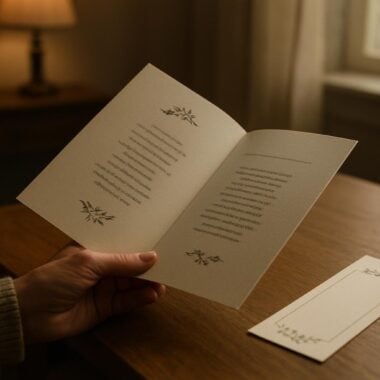
Serif fonts—those with small lines or ‘feet’ at the ends of letters—are a long-standing choice for funeral programs, obituaries, and formal printed materials. Examples such as Times New Roman, Garamond, and Georgia have a dignified, traditional feel that resonates with many families. These fonts are often seen in bi-fold and 8-page programs, where clarity and respect are top priorities.
Serif fonts are particularly readable in longer passages, making them ideal for the main body text of obituary templates, order of service, and memorial quotes. Their classic look conveys a sense of stability and reverence, which can be comforting during times of loss. For families who value tradition, a serif font provides an understated elegance that never feels out of place.
When using serif fonts, consider pairing them with more decorative fonts for headings or names to add subtle emphasis. For example, you might use Garamond for the body text but choose a gentle script for the cover title. This combination creates visual hierarchy without sacrificing the program’s overall harmony. If you’re designing a 12-page or 16-page program, serif fonts help maintain readability over many pages.
A practical tip is to use a slightly larger size for body text (11-12pt) to ensure that all guests, including those with visual impairments, can read comfortably. At DisciplePress, our custom design services can help you select and adjust serif fonts to perfectly fit your chosen program format, whether it’s a classic booklet program or a more concise memorial card.
Elegant Script Fonts: Expressing Emotion and Personal Touch
Script fonts, with their flowing, handwritten appearance, offer a beautiful way to add a personal and emotional touch to funeral programs. Examples like Edwardian Script, Great Vibes, and Allura evoke a sense of grace, love, and remembrance. These fonts are particularly well-suited for highlighting names, headings, or meaningful quotes on the cover or inside pages of celebration of life programs.
While script fonts can be visually striking, it’s essential to use them thoughtfully. Because their ornate style can be harder to read in large blocks of text, they’re best reserved for short elements such as the loved one’s name, poem titles, or special messages. For longer passages, pair script fonts with a clean serif or sans-serif for the main text to maintain readability.
Families often choose script fonts to convey warmth and individuality. For example, if you’re preparing a memorial bookmark or prayer card, incorporating a gentle script for the name or date can create a keepsake that feels uniquely personal. Script fonts also work beautifully in faith-based programs, where spiritual verses or prayers can be presented with added grace.
When selecting a script font, consider the personality of your loved one. A more elaborate script may suit someone who enjoyed art and creativity, while a simpler, softer script can reflect a gentle spirit. If you’re unsure, our design gallery at DisciplePress showcases script font examples across various products, allowing you to see how different options look in real-life memorial pieces.
Clean Sans-Serif Fonts: Modern Simplicity and Accessibility
Sans-serif fonts—those without extra lines at the ends of letters—have become increasingly popular for their clean, modern appearance. Fonts like Arial, Helvetica, and Calibri offer straightforward readability and are especially suited for families seeking a contemporary look or planning a celebration of life service. These fonts are often chosen for 8-page or 12-page programs, as well as folded memorial cards and memorial bookmarks.
One of the main advantages of sans-serif fonts is their clarity at smaller sizes, making them a practical choice for programs with limited space or dense content. They’re also easier to read in digital formats, which is helpful if you’re sharing an online version of the program or using digital memorial slideshows. DisciplePress can ensure that your printed and digital materials maintain a cohesive, accessible aesthetic by using these fonts across formats.
Sans-serif fonts are versatile enough to work with a range of themes—from minimalist nature-themed programs to vibrant celebration of life events. When paired with a decorative script for headings, sans-serif body text helps balance style with function. For example, using Arial for the order of service and pairing it with a soft script for the name on the cover can create a harmonious effect.
If your priority is accessibility—such as for guests with vision challenges—sans-serif fonts are a dependable option. Our team at DisciplePress can help you select the right weights and sizes to maximize legibility, whether you’re preparing a tri-fold program or a large memorial poster. For rush orders or same-day printing, sans-serif fonts also process cleanly for quick, high-quality results.
Decorative and Themed Fonts: Reflecting Personality and Theme
Sometimes, families wish to reflect a loved one’s unique personality, hobbies, or cultural background through the design of the funeral program. Carefully chosen decorative or themed fonts can help achieve this, especially in angel-themed programs, nature-themed programs, or faith-based programs. For instance, a script with subtle leaf motifs might be perfect for a nature lover, while a cross-embellished font suits a deeply religious tribute.
It’s important to use decorative fonts sparingly and purposefully. Overuse can make a program feel cluttered or hard to read, especially in longer pieces like 20-page programs. Instead, reserve these fonts for section titles, cover headings, or accent elements such as favorite Bible verses or memorial quotes. This approach allows the personality of the font to shine without overwhelming the reader.
When selecting a themed font, consider how it interacts with other design elements—such as background images, color schemes, and the format of your chosen program. If you’re creating a memorial card with a floral background, a font with too many flourishes could compete visually; a simpler decorative font might be more appropriate. Our custom design services at DisciplePress can help you test different combinations before finalizing your layout.
For families using our obituary templates or planning a celebration of life, themed fonts can be a gentle way to personalize the tribute. Remember to always prioritize readability—if a font feels difficult to read at first glance, it may be best to choose a more traditional option for the main content, using decorative styles as subtle accents instead.
Font Pairing and Hierarchy: Creating Balance and Structure
A successful funeral program usually involves more than one font. Pairing two or three fonts thoughtfully can help create a clear visual hierarchy, guiding the reader’s eye through the information and distinguishing between sections. For example, you might use a bold serif for main headings, a gentle script for the loved one’s name, and a clean sans-serif for the body text in a bi-fold program.
When pairing fonts, look for contrasts that complement each other. A common and effective combination is serif for headings and sans-serif for body text, or vice versa. This contrast helps create distinction and visual interest without sacrificing harmony. For longer programs such as 16-page or 20-page booklets, this approach keeps the layout organized and engaging over many pages.
Maintain consistency in your pairings throughout the program. Using too many different fonts can make the piece feel disjointed or confusing, especially during an emotional event. Stick to two or three fonts at most, and use them in a predictable way—for example, always using the same font for section titles, captions, and main text. Our design gallery at DisciplePress offers examples of successful font pairings across various products, including memorial bookmarks and thank you cards.
Another tip is to use font size and weight to reinforce hierarchy. Larger, bolder fonts for headings and slightly smaller, lighter fonts for details help readers navigate the program easily. If you’re short on time, DisciplePress’s ready-made obituary templates and funeral programs come with professional font pairings, ensuring a balanced, elegant result even under tight deadlines or during rush orders.
Practical Tips for Readability and Printing
No matter how beautiful a font looks on screen, it must also print well on the chosen paper. Some fonts with thin lines or delicate flourishes may lose clarity when printed, especially on textured or colored paper. Before finalizing your design, print a test page to check for crispness and legibility. At DisciplePress, our team reviews every funeral program, prayer card, and memorial bookmark to ensure quality and readability.
Consider the size of your program and the amount of content you need to fit. For compact formats like folded memorial cards or 4×6 prayer cards, choose fonts that remain clear at smaller sizes. Avoid using all caps except for very short headings, as this can be difficult to read. For larger formats, such as 12-page or 20-page programs, maintain at least 11pt body text to aid readability.
The color of your font also matters. Ensure there is enough contrast between the font and the background—black or dark gray on white or cream paper is classic and reliable. Steer clear of overly light or pastel font colors, as these can disappear in print. If you’re unsure, our paper types guide and custom design services can help you select the best combination for your needs.
Finally, remember that emotional clarity is as important as visual clarity. When guests can easily read and follow the program, they are able to focus on remembrance and celebration rather than struggling with the text. If you’re facing time constraints or last-minute changes, our same-day printing and rush order services at DisciplePress help ensure your tribute is ready on time, without sacrificing quality.
Examples of Font Combinations for Different Program Types
To help you visualize how font choices come together, here are some example combinations tailored to specific types of funeral programs and memorial keepsakes. These examples draw from our experience at DisciplePress and are designed to offer comfort, clarity, and beauty in every format.
For a traditional bi-fold program, a pairing like Garamond (headings) with Times New Roman (body text) creates a timeless, respectful look. Adding a touch of Edwardian Script for the loved one’s name on the cover adds gentle warmth without compromising readability. This combination also works well for 8-page or 12-page programs where space is at a premium.
In celebration of life programs, you might choose Calibri (body text) with Great Vibes (headings) for a fresh, uplifting feel. For nature-themed or angel-themed programs, consider pairing Georgia with a subtle script like Allura for section titles and favorite verses. Memorial bookmarks and prayer cards benefit from simple, high-contrast fonts such as Arial (main text) and a decorative font for the name or date.
For families short on time or seeking reassurance, DisciplePress offers ready-made templates and custom design services to ensure your chosen fonts are expertly paired and printed. Our design gallery includes samples of these combinations in real programs, memorial cards, and keepsakes, making the process less stressful during a difficult time.
Conclusion: Creating a Lasting Tribute Through Thoughtful Font Choice
Selecting the best fonts for funeral programs is a gentle act of care—one that helps honor your loved one’s memory and provides clarity and comfort to everyone present. By considering tradition, readability, and the emotional tone you wish to convey, you can create a memorial piece that supports the journey of grief while celebrating a life well-lived.
Remember to prioritize readability, pair fonts thoughtfully, and use decorative or themed fonts with intention. Whether you’re preparing a simple bi-fold program, an 8-page celebration of life piece, or a keepsake memorial bookmark, the right font choices make a meaningful difference. Our team at DisciplePress is here to guide you, offering custom design services, a variety of program types, and compassionate support every step of the way.
If you have questions about font selection, printing, or program formats, please reach out to us. Our design gallery, paper types guide, and ready-made obituary templates are available to help you visualize and create a tribute that feels just right. We also offer same-day printing and rush orders for families with urgent needs.
In these moments of sorrow and remembrance, every detail matters. We are honored to support you as you create a lasting, beautiful tribute—one that brings comfort, connection, and enduring memories for all who gather to honor your loved one.
Related Articles
FAQ: Best Fonts for Funeral Programs
What is the most popular font for funeral programs?
Times New Roman and Garamond are among the most popular choices for funeral programs due to their classic, readable appearance. They convey tradition and dignity, making them especially suited for formal services and obituary templates. Our team at DisciplePress can help you select and customize these fonts for any program type.
Can I use more than one font in a funeral program?
Yes, using two or three fonts can help create a clear visual hierarchy. For example, pair a serif font for headings with a sans-serif for body text, and a gentle script for the loved one’s name or special quotes. Our custom design services can recommend harmonious pairings for your chosen funeral program format.
Are script fonts appropriate for all memorial pieces?
Script fonts add a personal and emotional touch, but they should be used sparingly and mainly for headings or names. For the main content, stick to more readable serif or sans-serif fonts. If you’d like to see examples, our design gallery features script fonts in prayer cards, memorial bookmarks, and celebration of life programs.
What if I need my funeral programs printed quickly?
DisciplePress offers same-day printing and rush order services for funeral programs, memorial cards, and other keepsakes. Our team ensures your chosen fonts are print-ready and clear, even under tight deadlines. Contact us for assistance with urgent orders.
How do I choose a font that reflects my loved one’s personality?
Think about their style, passions, and the tone you wish to set—classic, modern, gentle, or creative. Our custom design services and design gallery offer inspiration and support, helping you select fonts that honor your loved one’s unique spirit across every program type, from bi-fold and tri-fold programs to memorial bookmarks and prayer cards.