 Free Shipping Over $50
  888-432-8363


 Obituary/Programs
 No-Fold Memorial Programs
 4 Page Funeral Programs
 8 Page Memorial Programs
 12 Page Funeral Programs
 16 Page Funeral Programs
 20 Page Funeral Programs
 Tri-Fold Funeral Programs
 Complete Memorial Packages
 Cards & Bookmarks
 Saint Prayer Cards
 Folded Memorial Cards
 Folded Holy Cards
 Memorial Bookmarks
 Thank You Cards
 Share-A-Memory Cards
 Memorial Magnets
 Memorial Posters
 Guest Books
 Slide Shows
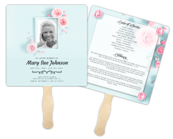 Memorial Fans
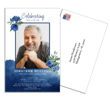 Death Announcements
 Take Away Keepsakes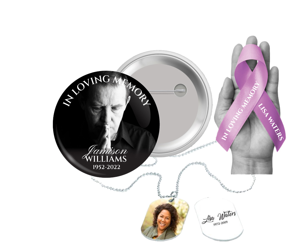
 Church Products
We understand that you’re here during a difficult time. The loss of a loved one is a profound experience, and it’s our goal to help you through this process with care and respect. In this article, we’ll offer gentle guidance on how to choose the right fonts and colors for your memorial printing needs, honoring your loved one’s memory in a way that feels right for you and your family.
Why Fonts and Colors Matter
When mourning a loved one, every detail matters. The fonts and colors you choose for memorial prints such as funeral programs or memorial bookmarks can communicate a sense of your loved one’s personality, your family’s style, and the mood of the occasion. They can make the difference between a simple piece of paper and a cherished keepsake.
Choosing the Right Font

In the world of typography, different fonts can evoke different emotions. Some are formal and traditional, while others are more casual and contemporary. As you select a font, consider what would best reflect your loved one and the tone of the memorial service.
Traditional Fonts
Traditional fonts, such as Times New Roman or Georgia, are often associated with formality and dignity. They are a good choice for a classic, reverent commemoration.
Modern Fonts
Modern fonts, like Arial or Helvetica, can communicate a sense of minimalism and contemporary style. These may be fitting for a service that’s more relaxed or non-traditional.
Script Fonts
Script fonts, like Edwardian or Pacifico, convey a sense of elegance and warmth. They can be appropriate for a service that’s particularly heartfelt or romantic.
Selecting a Color Scheme
Color, like font, can also convey emotion and set the tone for your memorial prints. It’s often helpful to choose colors that your loved one enjoyed or that hold special significance for your family.
Neutral Colors
Neutral colors like black, white, or grey are often associated with formality and respect. They are a safe choice for any memorial service.
Warm Colors
Warm colors like red, orange, or yellow can convey a sense of comfort, love, and warmth. These might be suitable for a service that’s particularly intimate or celebratory.
Cool Colors
Cool colors like blue, green, or purple can communicate tranquillity and peace. These might be fitting for a service that’s focused on healing and remembrance.
Creating a Harmonious Design
Once you’ve chosen your fonts and colors, it’s important to create a harmonious design. Our team at DisciplePress is here to assist you with this, whether it’s for prayer cards, memorial cards, or any of our other memorial printing services.
Remember, these choices are deeply personal and there’s no right or wrong answer. The most important thing is that the end result feels right for you, and serves as a fitting tribute to your loved one.
Conclusion
At DisciplePress, we understand the importance of honoring your loved one’s memory. We offer Memorial Bookmarks, Funeral Programs and Prayer Cards to help you create meaningful tributes.
We hope this guide has been helpful during this difficult time. Remember, you’re not alone—our team at DisciplePress is here to support you every step of the way. We’re committed to helping you create a beautiful, meaningful tribute to your loved one’s life.