
 Free Shipping Over $50
  888-432-8363

 Obituary/Programs
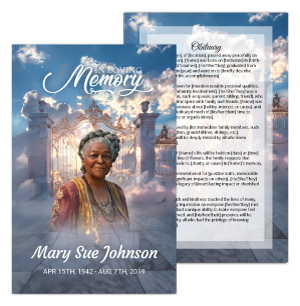 No-Fold Memorial Programs
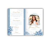 4 Page Funeral Programs
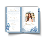 8 Page Memorial Programs
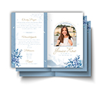 12 Page Funeral Programs
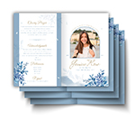 16 Page Funeral Programs
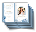 20 Page Funeral Programs
 Tri-Fold Funeral Programs
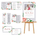 Complete Memorial Packages
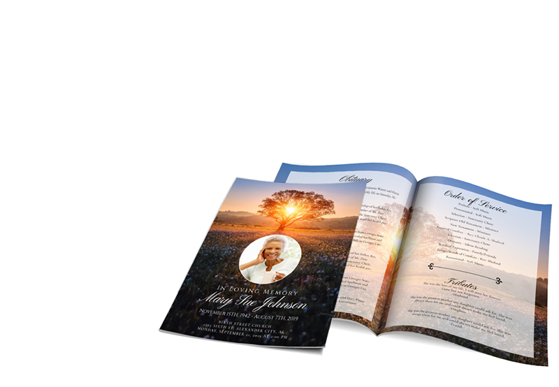
 Cards & Bookmarks
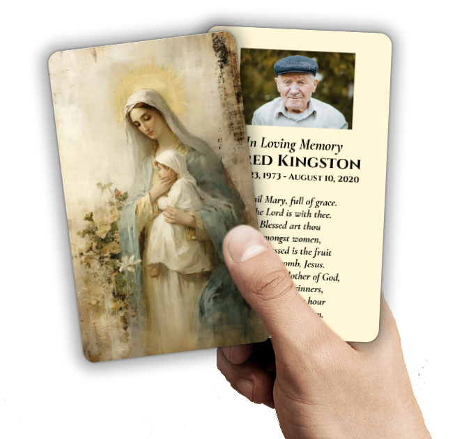 Saint Prayer Cards
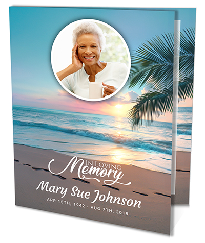 Folded Memorial Cards
 Folded Holy Cards
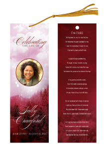 Memorial Bookmarks
 Thank You Cards
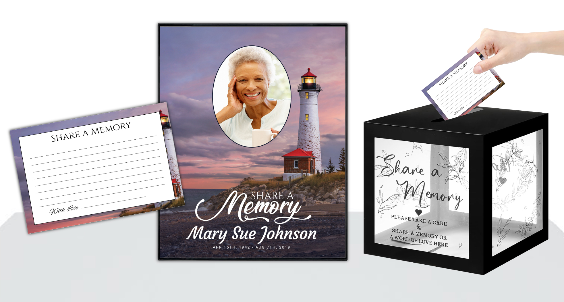 Share-A-Memory Cards
 Memorial Magnets
 Memorial Posters
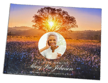 Guest Books
 Slide Shows
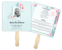 Memorial Fans
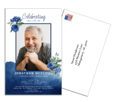 Death Announcements
 Take Away Keepsakes
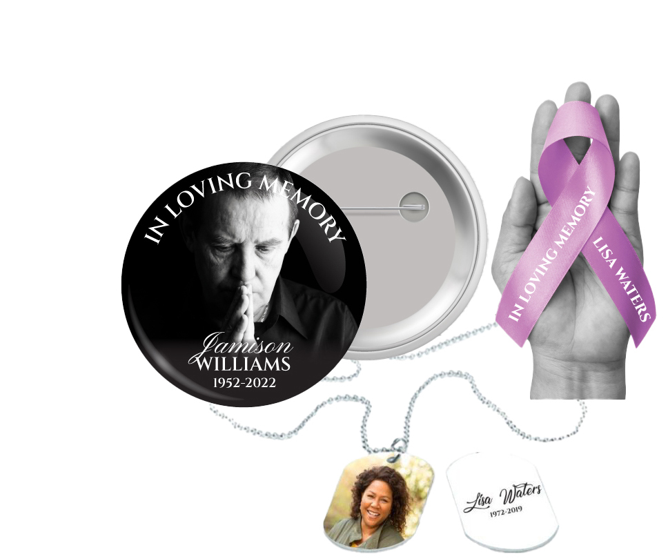
 Church Products
Introduction
At DisciplePress, we understand the emotional journey you are embarking upon as you plan a memorial or funeral for your loved one. We appreciate the strength it takes to make decisions during this challenging time. One such critical aspect is memorial printing, a tangible tribute that will forever hold the memory of your loved one. This guide aims to help you navigate the process of selecting the right fonts and colors for your memorial printing needs.
From funeral programs to prayer cards, the design elements you choose should reflect the unique personality of your loved one and provide comfort to the grieving. The importance of this process can feel overwhelming, but we are here to guide you every step of the way.
In the following sections, we will delve into the importance of color selection and typography, provide practical tips for making these decisions, and address common questions or concerns you may have. No matter what your needs, from bi-fold programs to 8-page programs, this guide will help you create a memorial print that is as unique as your loved one.
We hope that this guide brings you some comfort and ease during this difficult time and that the final result will be a beautiful, lasting tribute to your loved one’s life.
The Significance of Color
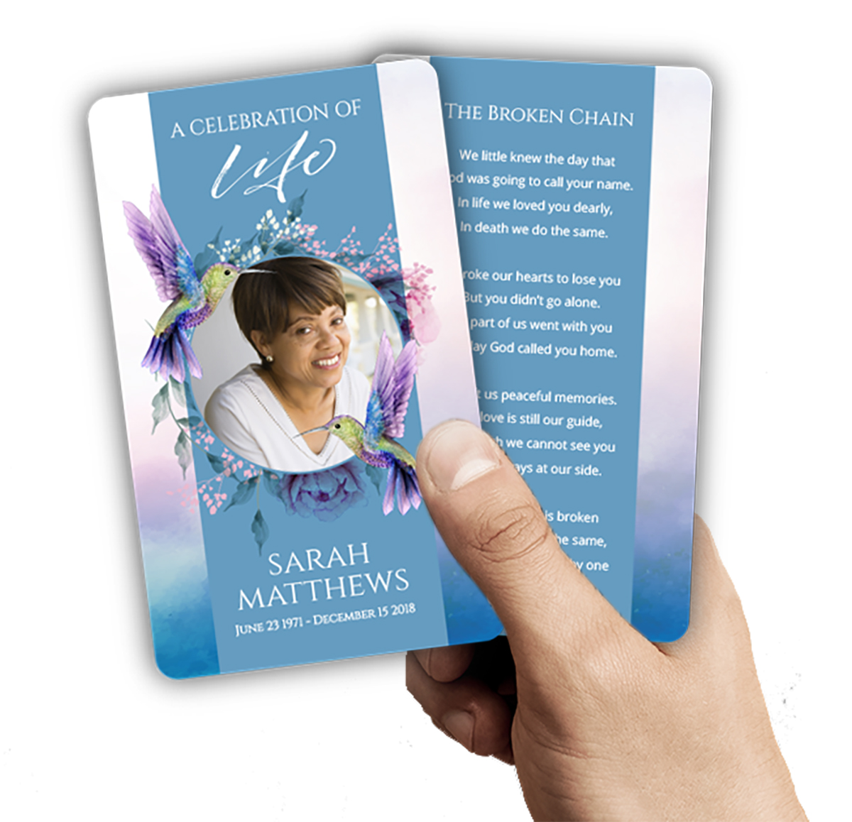
Colors evoke emotions and memories. When choosing colors for memorial printing, it’s essential to consider the emotional impact of your selection. Bright colors like yellow and orange can symbolize joy and vitality, while blues and purples might evoke a sense of peace and tranquility. The color choice should reflect the personality and spirit of your loved one.
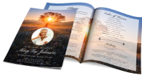
Every memorial should reflect the unique life and legacy of your loved one. We offer Memorial Cards, Folded Memorial Cards and Large Memorial Cards to help you create meaningful tributes.
For instance, if they were a nature lover, you might choose shades of green or floral hues. If they were full of energy and vivacious, bold, vibrant colors could be the perfect choice. Remember, there’s no right or wrong color; it’s about honoring your loved one’s unique spirit.
Another aspect to consider is cultural or religious significance. In some cultures, specific colors are associated with mourning and remembrance. Be sure to honor these traditions if they align with your loved one’s beliefs.
At DisciplePress, we offer a variety of color options for our memorial printing services, including funeral programs and prayer cards. Our custom design services can help tailor these pieces to your specific needs.
Understanding Typography
Typography is the style and appearance of printed matter. It’s more than just a design element; it’s a way to express emotion and personality. The right font can add depth to the words and create a lasting impression.
Serif fonts, like Times New Roman or Georgia, add a touch of tradition and formality to your memorial print. These are often used in more traditional funeral programs. On the other hand, Sans Serif fonts like Arial or Helvetica, offer a more modern feel, suitable for Celebration of Life or non-traditional services.
Script fonts, such as Brush Script or Lucida Handwriting, can add a personal touch, often used for quotes or special messages. Remember, readability is crucial. The font should be easy to read for all attendees, including those with visual impairments.
At DisciplePress, we have a broad range of fonts available for our memorial printing services. From bi-fold programs to 8-page programs, our team can guide you in choosing the right typography to honor your loved one.
Combining Colors and Fonts
Now that you’ve chosen your colors and fonts, it’s time to bring them together. The right combination can set the tone for the memorial and evoke the desired emotions. For example, a dark blue color paired with a Serif font can create a serene and respectful atmosphere.
Every memorial should reflect the unique life and legacy of your loved one. We offer Large Memorial Cards, Memorial Bookmarks and Funeral Programs to help you create meaningful tributes.
It’s important to consider contrast for readability. Dark fonts on light backgrounds or light fonts on dark backgrounds work best. For instance, white script font on a dark green background could be a beautiful tribute to a loved one who enjoyed gardening.
It’s not uncommon to feel unsure about your choices. That’s why we offer custom design services at DisciplePress. Our experienced team can help you visualize the combination of colors and fonts, ensuring that your memorial print is a fitting tribute to your loved one.
Creating a Consistent Theme
Consistency is key in design. Using a consistent color scheme and font across all memorial prints, such as funeral programs, prayer cards, and memorial bookmarks, creates a unified and harmonious tribute. This consistency can also provide a sense of comfort and familiarity to those grieving.
For instance, if you’ve chosen a tranquil blue and a classic Serif font for the funeral program, carry this theme into the prayer cards and memorial bookmarks. This creates a seamless tribute and a comforting sense of unity.
With DisciplePress, you can ensure this consistency across all printed materials. We offer a variety of memorial printing services, including funeral programs of various formats, memorial cards, and bookmarks.
Considering Practical Aspects
While color and font choices are largely about personal preference and emotional resonance, there are also practical considerations to keep in mind. These include printing deadlines, cost, and the readability of your chosen fonts and colors.
If you are working within a tight timeline, our same-day printing and rush orders can ensure timely delivery of your memorial prints. We also offer a range of options to suit different budgets without compromising the quality and significance of your memorial prints.
Remember, the aim is to create a memorial print that will comfort the bereaved and honor your loved one. A beautiful design that is difficult to read or overly expensive can distract from this purpose. Always consider the balance between aesthetic appeal and practicality.
Conclusion
Choosing the right fonts and colors for memorial printing is a deeply personal journey. It’s about honoring your loved one’s unique spirit and providing comfort to those left behind. Whether you prefer the simplicity of a bi-fold program or the detailed narrative of an 8-page program, the design should reflect the love and respect you hold for your loved one.
At DisciplePress, our aim is to support you during this challenging time. Our range of services, from custom design to same-day printing, are designed to make this process as smooth and comforting as possible. We are here to help you create a fitting tribute to your loved one’s life.
We hope that this guide has provided helpful insights into the process of selecting colors and fonts for memorial print. Remember, there’s no right or wrong choice. It’s about creating a meaningful tribute that resonates with the spirit of your loved one and offers comfort to those grieving.
If you have any further questions or need assistance, please don’t hesitate to reach out to us. We are here for you, ready to help you honor your loved one in the most beautiful and heartfelt way possible. Learn more about DisciplePress and our commitment to serving families. Browse our design gallery for inspiration. For personalized assistance, please contact us.