 Free Shipping Over $50
  888-432-8363


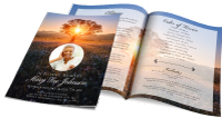 Obituary/Programs
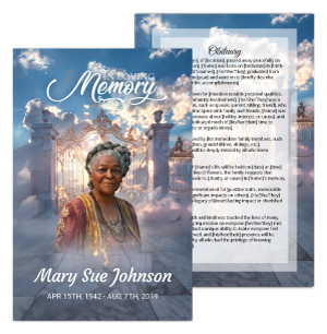 No-Fold Memorial Programs
 4 Page Funeral Programs
 8 Page Memorial Programs
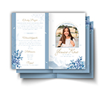 12 Page Funeral Programs
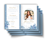 16 Page Funeral Programs
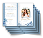 20 Page Funeral Programs
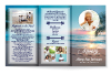 Tri-Fold Funeral Programs
 Complete Memorial Packages
 Cards & Bookmarks
 Saint Prayer Cards
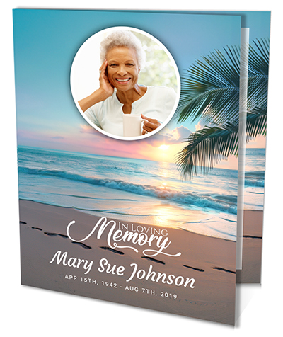 Folded Memorial Cards
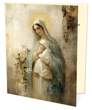 Folded Holy Cards
 Memorial Bookmarks
 Thank You Cards
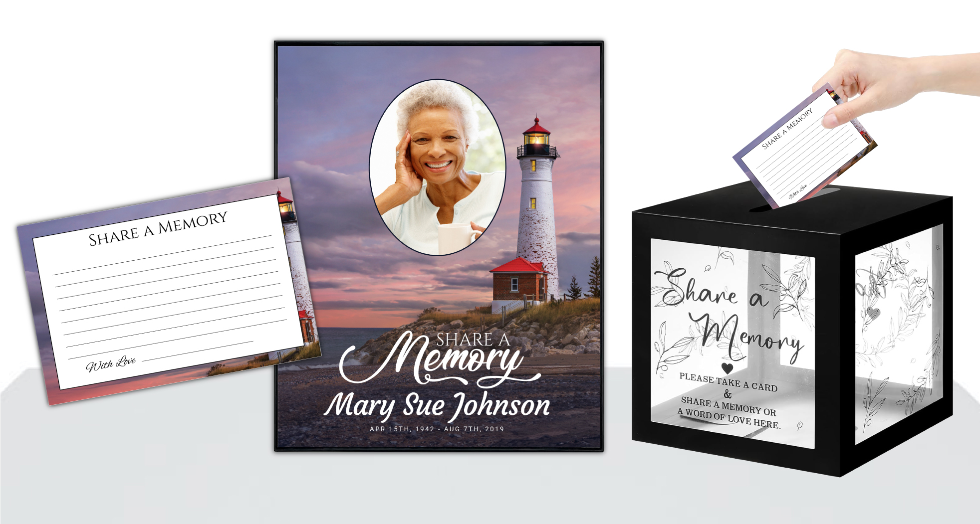 Share-A-Memory Cards
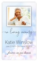 Memorial Magnets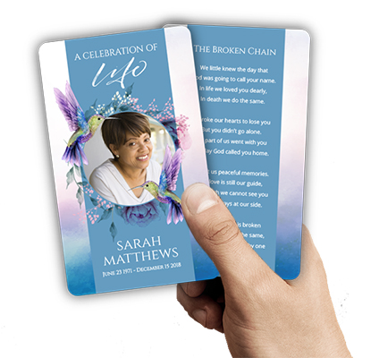
 Memorial Posters
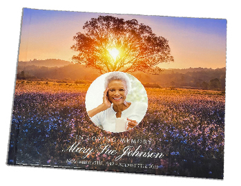 Guest Books
 Slide Shows
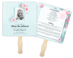 Memorial Fans
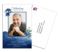 Death Announcements
 Take Away Keepsakes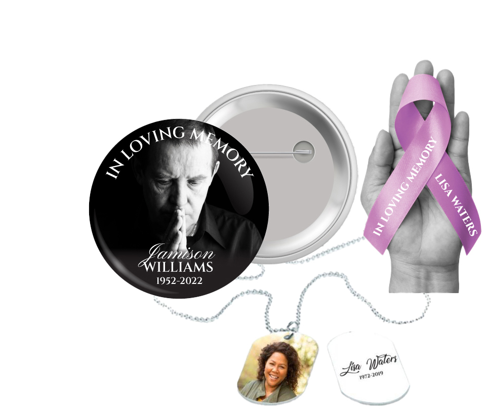
 Church Products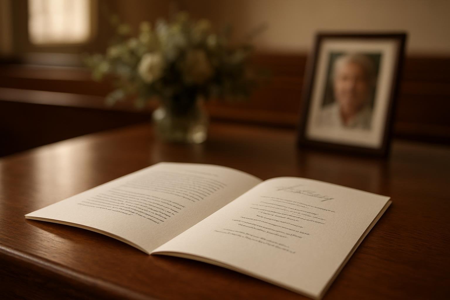
Finding Comfort in Design: The Importance of Thoughtful Font Pairings
During times of loss, even the smallest details can feel overwhelming. Choosing the right font combinations for a loved one’s funeral program may seem minor in the grand scheme, yet it plays a significant role in shaping the tone and clarity of a memorial tribute. The process of selecting funeral program font pairings is not simply about aesthetics; it’s about honoring a life with dignity and creating a printed keepsake that supports and comforts all who attend.
At DisciplePress, we understand that families and funeral directors face these design decisions during times of deep emotion. Every choice—from the words themselves to the way they appear on the page—carries meaning. Font pairings affect readability, evoke emotion, and underscore the atmosphere of a service, whether traditional, faith-based, or a celebration of life. A well-chosen combination can elevate a bi-fold program, a tri-fold program, or a set of memorial bookmarks, transforming them into cherished mementos.
This article is dedicated to helping you navigate the specific challenge of mixing fonts within a single piece—especially for headings, body text, and quotes or scripture. We’ll explore what works, what to avoid, and how to combine typefaces in ways that communicate love, respect, and togetherness without confusion or distraction. Our guidance is grounded in experience with a wide range of formats, including 8-page, 12-page, and 16-page programs, as well as prayer cards and thank you cards.
We invite you to find reassurance and practical advice here. Whether you’re designing a booklet program on your own, collaborating with a funeral home, or seeking custom design services with a quick turnaround time, our goal is to support you. Each section will offer clear examples, common pitfalls, and gentle tips, so you can make confident, heartfelt choices for your unique memorial printing needs.
The Emotional Impact of Fonts: Why Pairings Matter in Memorial Printing
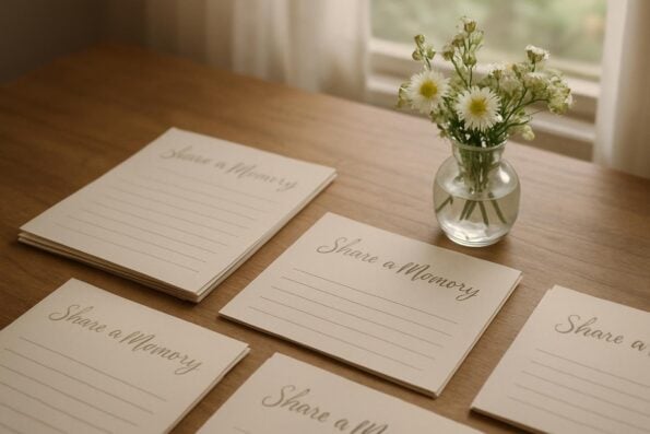
Fonts do more than convey words—they communicate emotion, personality, and reverence. In the context of funeral and memorial printing, the right funeral program font pairings can offer comfort and create a sense of calm. Conversely, mismatched or clashing fonts may introduce unintended tension or distraction, which is why it’s so important to approach font selection with care and intention.
At DisciplePress, we understand the importance of honoring your loved one’s memory. We offer Memorial Bookmarks, Funeral Programs and Prayer Cards to help you create meaningful tributes.
Pairing fonts effectively is about creating harmony. For instance, a gentle serif font for the body text can evoke tradition and warmth, while a soft script for headings adds an elegant, personal touch. When these are used together in a bi-fold program or a celebration of life booklet, the design feels unified, supporting a respectful and comforting atmosphere for grieving families and friends.
Consider the emotional tone you wish to set. A faith-based program may benefit from classic, timeless fonts that reflect the solemnity of the occasion. In contrast, a celebration of life program might incorporate a friendly sans-serif paired with a modern script, creating a light and uplifting feel. The fonts you choose should align with the life and legacy being honored, as well as the preferences of those who are mourning.
Practicality is another key concern. Grieving attendees may include elders or those with visual impairments, so clear, readable font combinations are essential. We recommend testing font pairings at both small and large sizes, especially if you’re preparing an 8-page or 16-page program with varying text density. Ultimately, thoughtful font pairings can guide mourners through the service, helping them focus on remembrance rather than deciphering difficult text.
Principles of Successful Funeral Program Font Pairings
Creating balanced and beautiful funeral program font pairings starts with understanding a few fundamental principles. One of the most important is contrast—selecting two fonts that differ in style and weight, yet complement each other. For example, pairing a classic serif with a gentle script provides hierarchy and draws attention to headings or quotes without overpowering the body text.
Another key principle is consistency. While it’s tempting to use many fonts to capture different aspects of a loved one’s personality, limiting your selection to two or three at most helps maintain a cohesive and respectful look. This is especially important in booklet programs or 12-page programs, where design elements repeat across multiple spreads. Too much variety can feel chaotic, especially during an emotional time.
Balance is also crucial. Make sure one font takes the lead as the primary text (usually a readable serif or sans-serif), while the secondary font is reserved for headings, names, or special passages. In memorial cards and prayer cards, for example, using a script only for the name of the loved one creates a poignant focal point. Body text should always be clear, avoiding ornate scripts or novelty fonts that may be hard to read.
Finally, always test your pairings in print. What looks good on screen may not translate well onto paper, especially if you’re using textured stocks or printing at small sizes. If you’re working with DisciplePress for custom design services or same-day printing, our team can provide samples and guidance to ensure your chosen fonts look beautiful in the final product—whether it’s a tri-fold program, share a memory card, or memorial bookmark.
Classic and Timeless Funeral Program Font Combinations
Some font pairings have stood the test of time, offering both readability and elegance. For funeral programs, these classics are a safe and respectful choice, suitable for most formats—from simple bi-fold programs to elaborate 20-page booklets. A favorite example is combining Times New Roman or Garamond (for body text) with a script like Edwardian Script or Allura for headings and the loved one’s name.
DisciplePress is dedicated to helping families honor their loved ones with dignity and care. We offer Prayer Cards, Memorial Cards and Obituary Templates to help you create meaningful tributes.
Another enduring pairing is a clean sans-serif such as Helvetica or Arial for headings, paired with a serif like Georgia for the main text. This combination brings clarity and a gentle modern touch to celebration of life programs or memorial cards. For those seeking a subtle sense of tradition, pairing Baskerville with a lighter script font can add a sense of grace to faith-based programs or thank you cards.
When using classic pairings, consider the tone of your service. Serif fonts often convey tradition, solemnity, and formality, making them ideal for religious ceremonies or angel-themed programs. Sans-serifs feel contemporary and approachable, suitable for non-traditional gatherings or memorial bookmarks intended as keepsakes. Scripts should be used sparingly, as accents or highlights, to preserve readability and focus.
Regardless of the pairing, always ensure adequate contrast in weight and style. For example, use a bold serif for headings and a regular weight for body text, or vice versa. This hierarchy helps guide the reader’s eye through the program, allowing for a more meaningful and comforting experience during the service.
Modern and Personalized Pairings: Reflecting Individual Legacies
For many families, personalization is an essential part of honoring a loved one’s memory. Modern funeral program font pairings can reflect unique personalities, interests, or cultural backgrounds. For example, pairing a geometric sans-serif like Montserrat for headings with a soft, humanist sans-serif like Open Sans for body text lends a contemporary, friendly feel—perfect for celebration of life programs or memorial garden flags.
If the deceased was known for creativity or a vibrant spirit, consider pairing a hand-lettered script (such as Pacifico) with a simple sans-serif. Use the script for quotes or section headings, and the sans-serif for the main text. This approach works beautifully on share a memory cards, where guests are invited to contribute their own reflections in a format that feels both personal and accessible.
For faith-based or multi-generational gatherings, you might blend tradition with modernity by pairing a serif like Merriweather for body text with a contemporary script or decorative font for the name and headings. This honors the past while celebrating the present, creating a bridge between generations. When working with DisciplePress, our custom design services can suggest modern pairings tailored to your needs and preferences.
Remember, personal touches should never compromise clarity. Avoid overly ornate or trendy fonts for large blocks of text, especially in multi-page programs or prayer cards. Instead, use decorative fonts for smaller elements and ensure the majority of the program remains easy to read, respecting all who gather to remember and celebrate a life well-lived.
Common Pitfalls to Avoid When Pairing Fonts for Memorial Printing
While it’s tempting to express creativity in design, certain pitfalls can detract from the dignity and solace a memorial program should provide. One of the most common mistakes is using too many fonts within a single piece. This can cause visual clutter and make it difficult for mourners to follow the content, especially in 16-page or 20-page programs with substantial information.
Avoid pairing typefaces that are too similar or too different. For example, combining two ornate scripts or two bold sans-serifs leads to confusion rather than contrast. Instead, select fonts that complement each other in style and weight. If you’re unsure, refer to trusted pairings or consult with our design gallery for inspiration.
Another frequent issue is the use of novelty or decorative fonts for body copy. While these may look appealing in short headings, they quickly become difficult to read in longer passages—especially in funeral programs or memorial cards that will be kept as keepsakes. Reserve playful or unique fonts for accents, such as a favorite quote or Bible verse, and stick to classic styles for the main text.
Finally, be mindful of sizing and color contrast. Small scripts or pale text on light backgrounds can be hard to decipher, particularly for older attendees. Test your chosen fonts in actual print sizes, and if time is short, our same-day printing and rush order services can help ensure your final memorial printing is both beautiful and legible, even on a tight turnaround time.
Special Considerations for Different Funeral and Memorial Products
The best font pairings often depend on the type of memorial product you’re creating. For funeral programs—whether bi-fold, tri-fold, or booklet formats—hierarchy is key. Use one font for section headings, another for body text, and consider a third, decorative font only for the name or significant quotes. This approach works well in both 8-page and 12-page programs, ensuring clarity throughout the service order, obituary, and poems.
Prayer cards and memorial cards are typically small, so font selection requires extra care. Avoid complex scripts or condensed typefaces that may reduce legibility. Instead, pair a soft serif with a clean sans-serif to create contrast and highlight the loved one’s name. Prayer cards often include scripture or prayers from our Bible verses collection, so readability is especially crucial.
For keepsake products like memorial bookmarks or memorial magnets, consider using a decorative font for the name or date, balanced by a simple, readable font for any accompanying text. These items are designed to be cherished long after the service, so the fonts should reflect both beauty and practicality. If you’re creating custom designs, our team can help you test options before finalizing your order.
When preparing thank you cards, folded memorial cards, or share a memory cards, opt for friendly, open fonts that invite personal messages. Combining a warm sans-serif with a gentle script can encourage guests to write their thoughts while maintaining an inviting appearance. DisciplePress can guide you in choosing pairings suited to every product format, ensuring your memorial suite is cohesive and meaningful.
Adapting Font Pairings for Cultural and Faith-Based Services
Every family and community brings its own traditions and beliefs to funeral and memorial services. The right font pairings can honor these differences, supporting the unique nature of each gathering. For example, many faith-based programs incorporate classic serif fonts that echo the formality and reverence of religious texts; pairing these with a subtle, elegant script can highlight favorite hymns or verses.
In multicultural or interfaith services, font choices might reflect multiple languages or styles. Choose clear, versatile fonts that support accented characters or non-Latin alphabets where needed. Our custom design services can assist in sourcing typefaces that accommodate diverse scripts, ensuring every attendee feels included and respected.
For angel-themed or nature-themed programs, softer, rounded fonts can evoke peace and serenity. Pair a delicate serif or sans-serif with a gentle calligraphic script to reinforce themes of hope and remembrance. This approach works especially well on memorial garden flags and memorial bookmarks, where the design becomes part of the tribute itself.
Ultimately, adapting font pairings to fit cultural and spiritual traditions is a way to show love and consideration. If you’re unsure of the best approach, we encourage you to contact us for guidance. Our experience with a wide range of program formats, from single-page memorial cards to 20-page booklets, allows us to offer suggestions that honor every story and background.
Practical Steps for Choosing and Testing Your Funeral Program Font Pairings
Selecting the ideal font pairing need not feel daunting, even in the midst of loss. Begin by identifying the tone and atmosphere you wish to create—formal, contemporary, uplifting, or deeply traditional. Collect examples of programs or keepsakes that resonate with you, drawing inspiration from our design gallery or customer testimonials.
Next, choose two or three fonts that meet your needs: a primary font for body text, a secondary for headings, and, if desired, a decorative accent. Use our obituary templates or order online tools to experiment with combinations in real time. Print samples at actual size, paying attention to clarity, comfort, and visual appeal. Consider how the fonts look together in different contexts, such as 8-page programs versus share a memory cards.
Ask for feedback from family members or your funeral director. They may notice issues with readability or emotional tone that escape notice during a busy, stressful time. If you have specific requirements or tight deadlines, our same-day printing and rush order services can help ensure your selections are honored, even when time is short.
Remember, you’re not alone. If you’re struggling with choices or want a professional touch, reach out to our team for custom design services. We’re here to walk with you through every step, offering support, expertise, and compassion as you create a memorial that truly reflects your loved one’s life and legacy.
Related Articles
Conclusion: Creating Lasting Comfort Through Thoughtful Font Pairings
Choosing funeral program font pairings is an act of both love and care—a way to honor memory, support mourners, and create a tangible keepsake that endures. By understanding the emotional impact of fonts, following principles of balance and contrast, and avoiding common pitfalls, you can design memorial prints that provide clarity, comfort, and dignity to all who gather in remembrance.
Whether you’re preparing a bi-fold program, memorial bookmarks, or thank you cards, thoughtful font pairings help tell your loved one’s story with grace. Remember to consider the needs of your audience, the tone of the service, and the practicalities of print. Our team at DisciplePress is dedicated to helping you through each step, from custom design services to same-day printing and rush orders when needed.
If you’re unsure where to begin, we invite you to explore our design gallery for inspiration, consult our paper types guide, or reach out for personal support. We offer a range of program formats—including tri-fold, 8-page, 16-page, and 20-page options—alongside memorial cards, prayer cards, and keepsake products, all crafted with empathy and respect.
In these tender moments, let your choices reflect the love and legacy of the one you’re honoring. Thoughtful design, gentle font pairings, and compassionate support can help transform grief into remembrance, and sorrow into a celebration of life. We’re here to walk this journey with you, offering guidance and comfort every step of the way. Learn more about DisciplePress and our commitment to serving families. Browse our design gallery for inspiration. For personalized assistance, please contact us.