 Free Shipping Over $50
  888-432-8363


 Obituary/Programs
 No-Fold Memorial Programs
 4 Page Funeral Programs
 8 Page Memorial Programs
 12 Page Funeral Programs
 16 Page Funeral Programs
 20 Page Funeral Programs
 Tri-Fold Funeral Programs
 Complete Memorial Packages
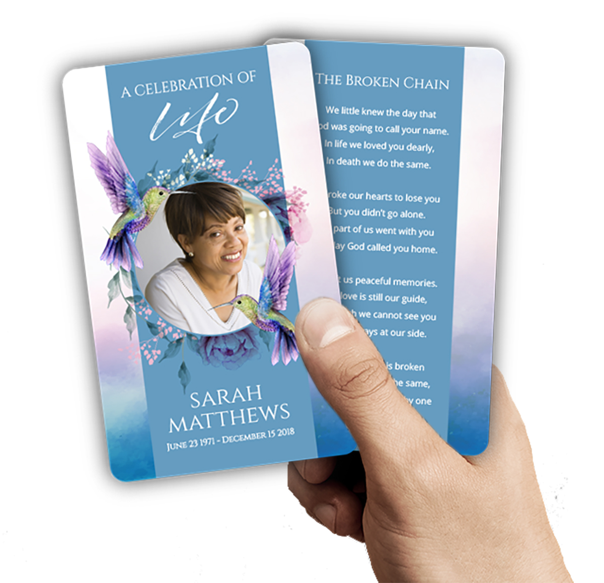 Cards & Bookmarks
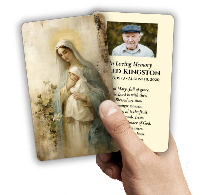 Saint Prayer Cards
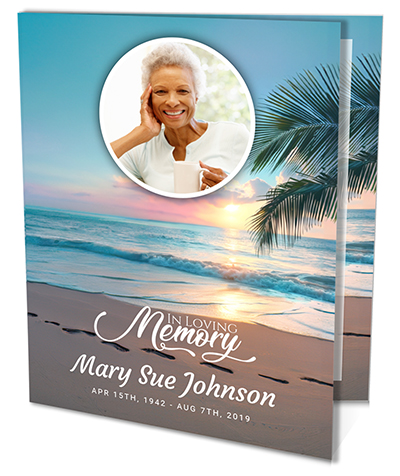 Folded Memorial Cards
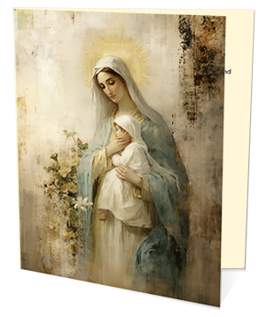 Folded Holy Cards
 Memorial Bookmarks
 Thank You Cards
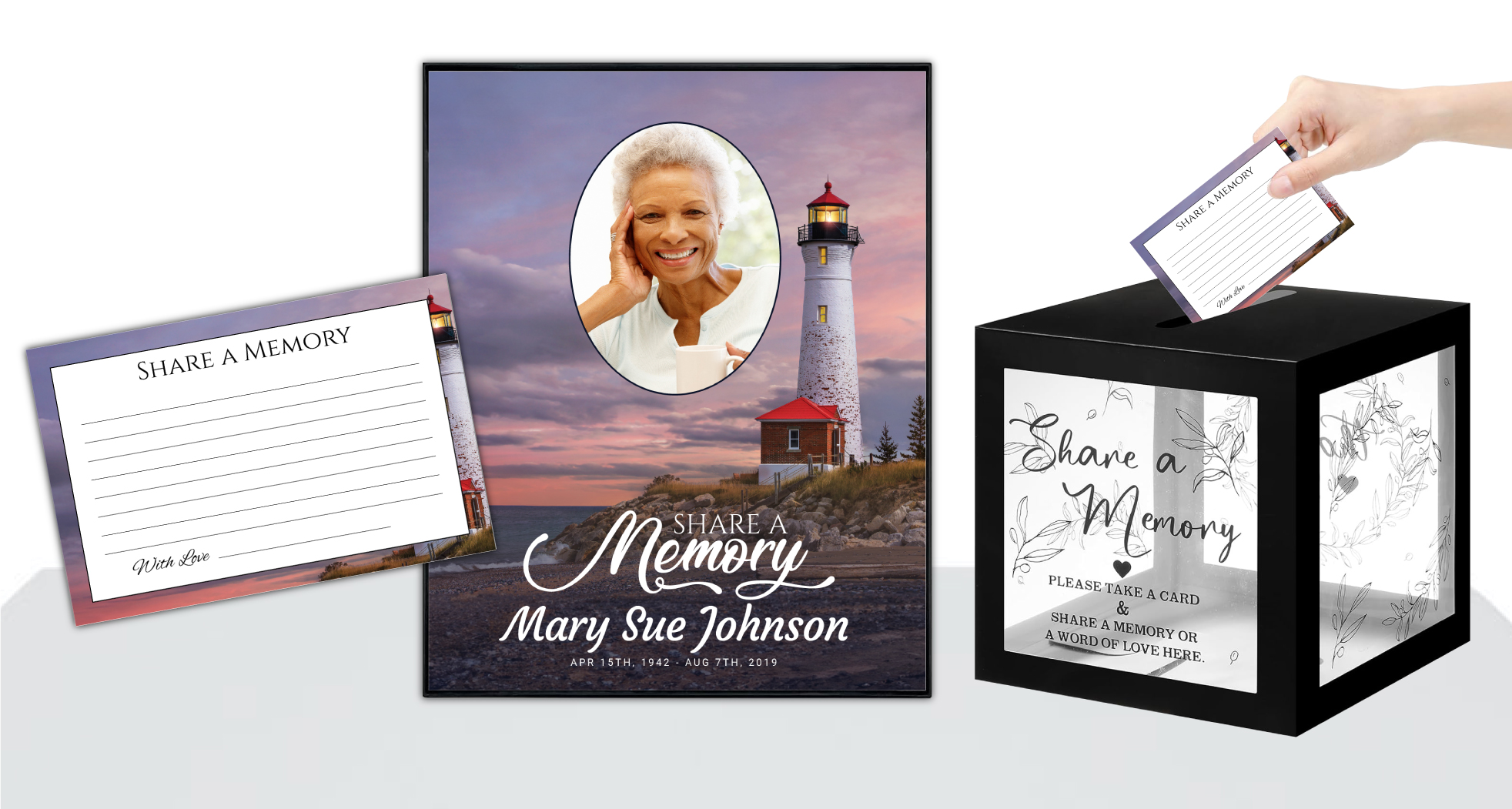 Share-A-Memory Cards
 Memorial Magnets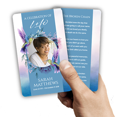
 Memorial Posters
 Guest Books
 Slide Shows
 Memorial Fans
 Death Announcements
 Take Away Keepsakes
 Church Products
Introduction: Navigating Design with Compassion and Care
For many families, creating a funeral program is more than just a practical task—it’s a heartfelt tribute to a loved one’s life and legacy. In moments of grief, these tangible keepsakes become cherished mementos, preserving memories for years to come. We recognize that, for many, crafting a DIY funeral program is both an act of love and a daunting responsibility. The desire to honor a beloved family member or friend can be accompanied by uncertainty, stress, and the pressure to “get it right,” especially when emotions run high.
As you embark on this meaningful journey, it’s common to encounter questions about design, layout, and formatting. The abundance of online templates and design tools can be both a blessing and a source of overwhelm. While DIY funeral programs offer the flexibility to personalize every detail, they also introduce potential pitfalls—especially for those without professional design experience. Simple design mistakes, such as poor font choices or confusing color schemes, can unintentionally detract from the beauty and clarity of your tribute.
This article is dedicated to helping you avoid the most common DIY funeral program mistakes. We will gently guide you through the top design pitfalls that families often encounter, offering practical advice and compassionate support each step of the way. From choosing fonts and colors to arranging photos and content, our aim is to provide you with the confidence and clarity needed to create a truly meaningful keepsake.
Throughout this guide, we’ll share examples, tips, and actionable solutions, referencing DisciplePress resources such as our bi-fold programs, memorial bookmarks, and custom design services where appropriate. Our hope is to make this process as healing and stress-free as possible, so you can focus on what matters most: celebrating the life and memory of someone you deeply love.
The Perils of Poor Font Choices: Readability and Respect

One of the most common DIY funeral program mistakes is selecting fonts that hinder readability or convey an unintended tone. In the emotional context of memorial services, clarity is paramount—guests of all ages must be able to easily read names, dates, and order of service details. Ornate script fonts, while elegant in moderation, can become difficult to decipher when used for large blocks of text or small type sizes.
We’re committed to supporting you through this difficult time with meaningful memorial resources. We offer Memorial Bookmarks, Funeral Programs and Prayer Cards to help you create meaningful tributes.
When designing any program—be it a simple bi-fold program or an elaborate 8-page booklet—consider using classic, clear fonts for the majority of your content. Sans-serif fonts like Arial or Helvetica, or gentle serif fonts such as Times New Roman or Garamond, offer a balance of formality and legibility. Reserve decorative scripts for headings or the loved one’s name, ensuring they remain at a readable size.
Mixing too many font styles can also lead to visual clutter. It’s best to select two complementary fonts: one for headings and one for body text. This creates a cohesive, harmonious appearance throughout the program. If you’re using DisciplePress’s online customization tool, you’ll find a curated selection of fonts designed specifically for memorial materials, helping you avoid common pitfalls.
Another tip is to pay close attention to font size and spacing. Ensure that text isn’t too small, especially for older attendees, and that there’s enough line spacing to prevent crowding. Before finalizing your design, print a test copy to confirm everything is easily readable. If you feel unsure, our custom design services at DisciplePress can provide guidance on appropriate font choices tailored to your vision and audience.
Color Choices: Balancing Beauty, Tone, and Clarity
Color is a powerful design element that sets the mood and emotional tone of a funeral program. However, one of the top DIY funeral program mistakes is using clashing colors or combinations that impair readability. Vibrant or overly saturated backgrounds can make text difficult to read, while mismatched colors may unintentionally distract from the program’s message.
When choosing colors, start with a soft, neutral palette—think whites, creams, gentle blues, or muted greens. These tones evoke a sense of peace and allow photos and text to stand out. If your loved one had a favorite color or you wish to reflect a particular theme, consider incorporating it as an accent rather than the dominant background. For example, a subtle border or a gentle watercolor wash can add personalization without overpowering the content.
Be mindful of color contrast. Dark text on a light background, or vice versa, ensures maximum readability. Avoid placing text directly over busy images or patterned backgrounds, as this can make important information hard to see. In our experience, families creating celebration of life programs often appreciate the gentle elegance of nature-themed backgrounds, which offer both beauty and readability.
Another consideration is cultural or religious symbolism in color choices. Certain hues may carry specific meanings—white for purity, purple for mourning, or gold for celebration. If you’re unsure, consulting with family members or your faith community can help guide your decisions. At DisciplePress, our wide selection of program themes—including faith-based and angel-themed programs—provides inspiration and reassurance as you choose your palette.
Confusing Layouts and Formatting: Ensuring Flow and Ease
Even the most heartfelt content can lose its impact if the layout is confusing or hard to follow. A common DIY funeral program mistake is arranging information in a way that disrupts the natural reading flow, leaving guests unsure where to look or what comes next. This is especially important in multi-page formats like 12-page or 16-page programs, where order and clarity are essential.
DisciplePress is dedicated to helping families honor their loved ones with dignity and care. We offer Prayer Cards, Memorial Cards and Celebration of Life to help you create meaningful tributes.
When planning your layout, start with a logical sequence: cover page, order of service, obituary or life story, tributes or poems, and closing information. Group related content together, and use clear headings to guide the reader. For bi-fold or tri-fold programs, ensure that panels are organized so that each section unfolds naturally. Visual hierarchy—using larger fonts or bold text for headings—helps guests navigate the program with ease.
White space is your friend. Allowing adequate margins and breathing room between sections prevents the program from feeling cramped or overwhelming. This is particularly important in smaller formats, such as prayer cards or memorial cards, where space is limited. Thoughtful spacing makes the program more inviting and easier to read, even when emotions may make concentration difficult.
Before printing, review your design for alignment and consistency. Are headings uniform? Do text blocks line up neatly? If you’re unsure about formatting or how to structure more complex booklet programs, DisciplePress offers custom design services to help you achieve a polished, professional finish. We also provide a wide range of sample layouts in our design gallery for inspiration and reference.
Overcrowding and Information Overload: Less Is Sometimes More
In the desire to honor every facet of a loved one’s life, it’s easy to fall into the trap of overcrowding the funeral program with too much information. One of the top DIY funeral program mistakes is trying to fit every poem, every photo, and every tribute into a limited space, resulting in a cluttered and overwhelming presentation.
Effective design leaves room for reflection. Prioritize the most meaningful content, such as a favorite Bible verse, a cherished photo, or a select number of tributes. If you wish to share additional memories or poems, consider including a memorial bookmark or a separate prayer card alongside the main program. These keepsakes offer a special touch and can be easily distributed to guests without overcrowding the core program.
When working with larger program formats, such as 8-page or 20-page booklets, you have the flexibility to include more content—yet even here, balance is key. Use clear section dividers, and ensure each page serves a distinct purpose. For smaller formats, focus on essential details: name, dates, order of service, and a brief tribute.
Remember, white space isn’t “empty”—it’s a vital design element that allows your loved one’s story to breathe. If you’re unsure what to include, our team at DisciplePress is here to offer compassionate guidance and examples from our extensive collection of celebration of life programs and memorial cards.
Photo Placement and Image Quality: Honoring Memories with Care
Photos are often the heart of a funeral program, stirring memories and emotions for everyone present. However, a frequent DIY funeral program mistake is placing photos in awkward positions or using images that are pixelated, too dark, or poorly cropped. This can unintentionally diminish the dignity of your tribute.
Choose high-resolution images that clearly show your loved one’s face and personality. Avoid using photos pulled from social media if they are low quality or heavily compressed. If possible, scan original prints at a high resolution for best results. When arranging photos, place them prominently on the cover or dedicate a full page in a booklet program to a photo collage.
Be mindful of photo orientation—landscape images work well for covers, while portrait photos are ideal for inside pages or memorial bookmarks. Ensure that images are not stretched or distorted to fit a space; instead, crop them carefully or add a tasteful border. If including group photos, make sure your loved one is the focal point, or use a soft vignette effect to gently highlight them.
If you’re unsure about image quality or placement, DisciplePress’s custom design services can assist with photo enhancement and layout. We also offer a helpful photo guidelines resource in our design gallery, ensuring every memory is presented with the care and clarity it deserves.
Inconsistent Themes and Visual Styles: Creating a Unified Tribute
Consistency in theme and visual style lends a sense of harmony and professionalism to any funeral program. One of the top DIY funeral program mistakes is mixing unrelated backgrounds, clipart, or decorative elements that clash with each other, leading to a disjointed appearance. A unified design helps guests connect emotionally and ensures that the program feels thoughtfully curated.
Begin by selecting a theme that reflects your loved one’s personality or beliefs. DisciplePress offers a range of options, including nature-themed programs, faith-based programs, and angel-themed programs. Once you’ve chosen a theme, carry it throughout the entire program—including colors, borders, and any graphic elements. This is especially important in multi-page formats like 12-page or 16-page programs, where consistency across pages enhances the overall effect.
Limit the use of clipart, icons, or decorative flourishes to those that complement your chosen theme. For example, if you select a nature theme, use soft leaf or floral accents rather than mixing in unrelated graphics. When including religious symbols, such as crosses or doves, ensure they’re used thoughtfully and respectfully, perhaps on the cover or near a meaningful verse.
Review your design before printing to confirm that all elements work together in harmony. If you’re unsure how to create a unified look, explore our design gallery for inspiration, or reach out to DisciplePress for custom design support. A cohesive visual style not only enhances the beauty of your tribute but also provides comfort and reassurance to all who attend.
Neglecting Print-Ready Details: Preparing for a Seamless Final Product
A beautifully designed program can be undermined by last-minute technical errors during printing. One of the top DIY funeral program mistakes is overlooking print-specific details such as bleed, margin, paper type, and resolution, which can result in cut-off text or images, faded colors, or unexpected formatting issues.
Before submitting your design for printing, check that all important content is safely within the printable area, away from edges that may be trimmed. Allow for at least a quarter-inch margin around all sides. Ensure that images are at least 300 dpi for crisp, clear printing—anything lower may appear blurry or pixelated.
Consider your paper selection carefully. Programs printed on glossy card stock offer vibrant colors and a polished look, while matte brochure paper provides a softer, more traditional feel. For keepsakes like memorial bookmarks or prayer cards, choose a sturdy paper that will withstand handling and serve as a lasting memento. Review our paper types guide for detailed advice on selecting the right material for your needs.
Always preview your file before printing, checking for typos, alignment issues, or missing elements. If you’re pressed for time, DisciplePress offers same-day printing and rush orders to ensure your programs are ready when you need them. Our team is happy to review your file for print-readiness, providing peace of mind during a stressful time.
Related Articles
Conclusion: Creating a Beautiful and Meaningful Tribute
Designing a funeral program at home is an act of devotion and remembrance—a final gift for your loved one and those who gather to honor them. While DIY funeral program mistakes are common, they are also avoidable with thoughtful planning and gentle guidance. By paying attention to font choices, color palettes, layout, content balance, photo quality, thematic consistency, and print readiness, you can create a program that brings comfort and lasting memories to all who receive it.
Remember, you’re not alone on this journey. The team at DisciplePress is here to support you, whether you’re seeking inspiration from our design gallery, exploring different funeral program types like bi-fold, tri-fold, or booklet programs, or relying on our custom design services for personalized assistance. Our range of keepsakes—including memorial bookmarks and prayer cards—can also help you share cherished memories beyond the service itself.
As you prepare your tribute, take time to reflect on what matters most to your family and your loved one’s unique story. Allow yourself grace in this process—perfection is less important than the love and thoughtfulness you pour into each detail. If you need help, don’t hesitate to contact us for compassionate advice or to learn more about our same-day printing and turnaround time options.
Above all, know that your efforts are meaningful. By honoring your loved one with care and intention, you create a legacy of remembrance that will comfort and inspire for years to come. We are honored to walk alongside you during this tender time, offering expertise, empathy, and hope as you craft a truly special farewell. Learn more about DisciplePress and our commitment to serving families. For personalized assistance, please contact us. We offer rush orders and same-day printing for urgent needs.