 Free Shipping Over $50
  888-432-8363


 Obituary/Programs
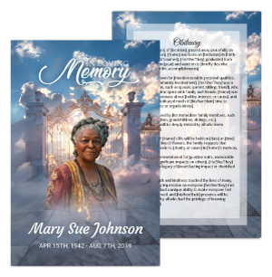 No-Fold Memorial Programs
 4 Page Funeral Programs
 8 Page Memorial Programs
 12 Page Funeral Programs
 16 Page Funeral Programs
 20 Page Funeral Programs
 Tri-Fold Funeral Programs
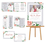 Complete Memorial Packages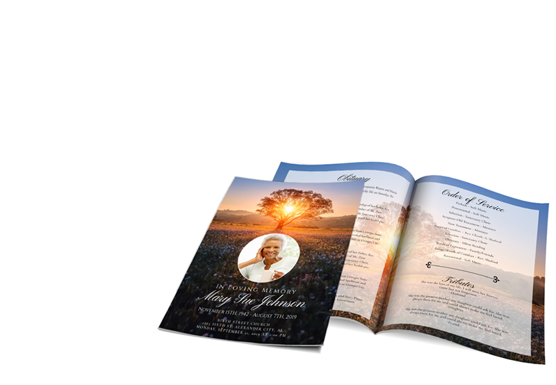
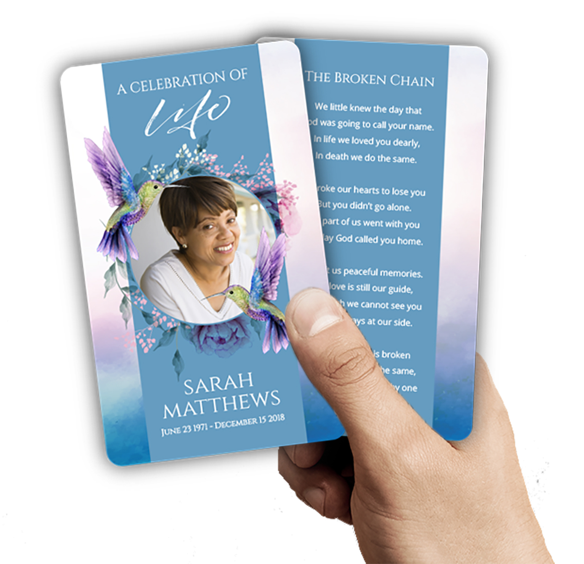 Cards & Bookmarks
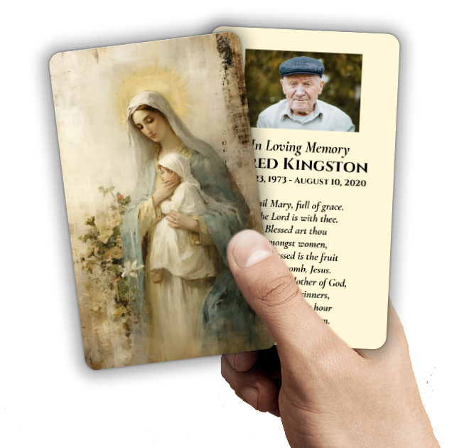 Saint Prayer Cards
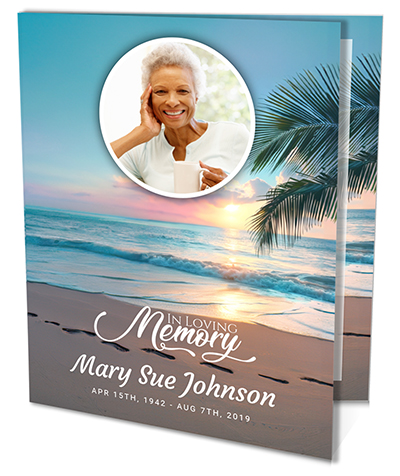 Folded Memorial Cards
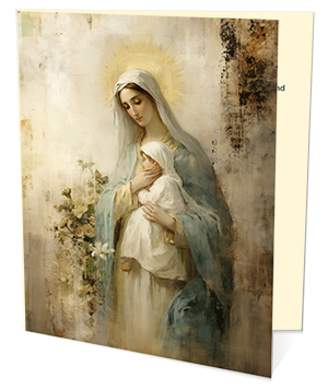 Folded Holy Cards
 Memorial Bookmarks
 Thank You Cards
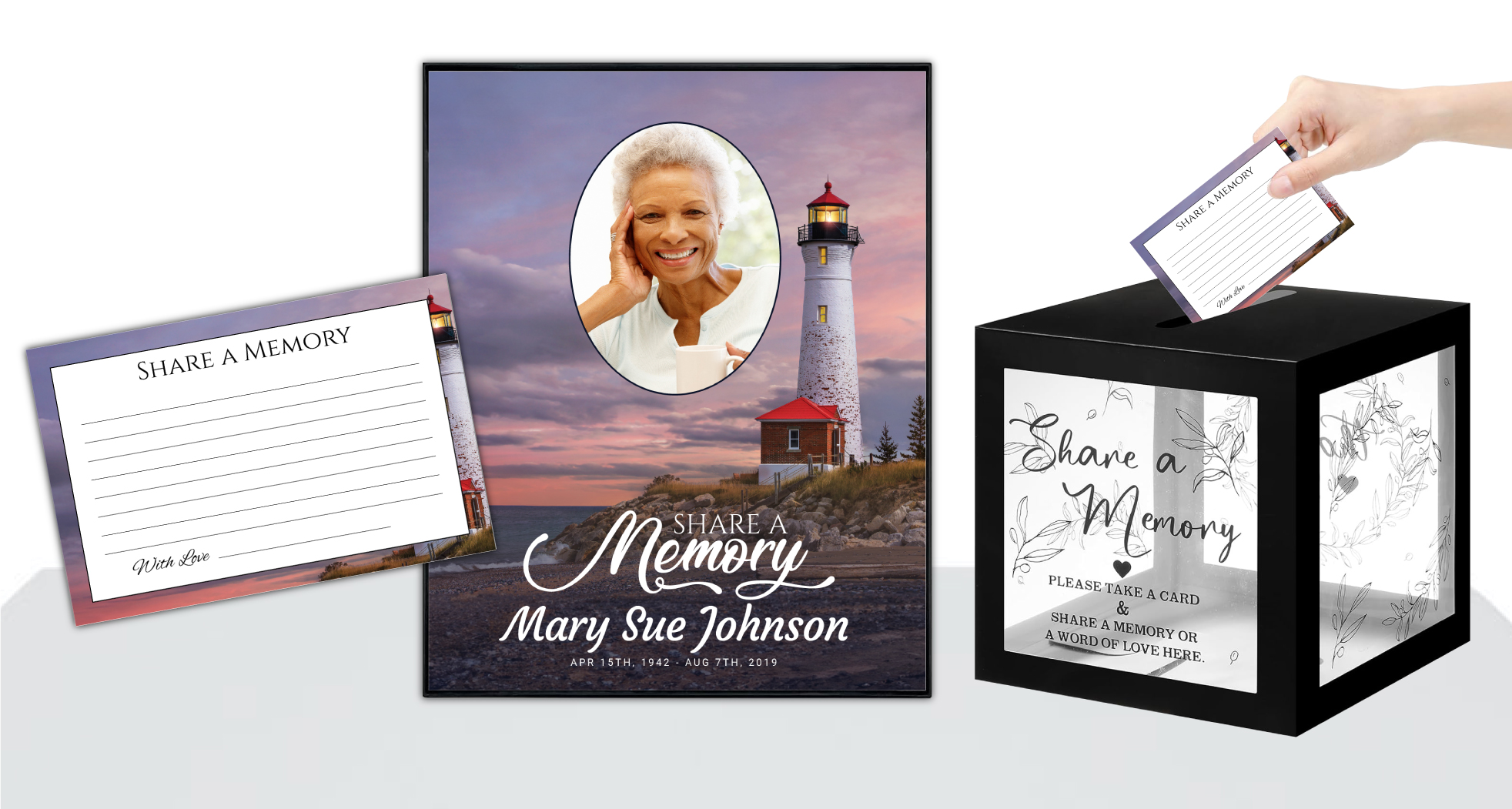 Share-A-Memory Cards
 Memorial Magnets
 Memorial Posters
 Guest Books
 Slide Shows
 Memorial Fans
 Death Announcements
 Take Away Keepsakes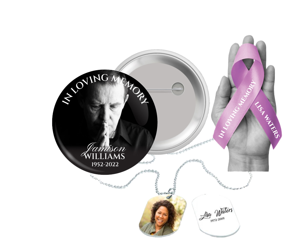
 Church Products
Finding Comfort and Meaning: Why Paper Color Matters in Funeral Programs
During times of loss, planning a meaningful memorial or funeral service can feel overwhelming. Every decision, from the readings to the music and the mementos, carries emotional weight. One question that often arises is, what color paper for funeral program is most appropriate? While it may seem like a small detail, the paper color you choose can be a gentle way to honor your loved one’s memory and evoke the atmosphere you wish to create for those gathering to remember.
At DisciplePress, we understand that each family’s journey through grief is unique. When you’re tasked with designing a funeral program—whether it’s a simple bi-fold program, a detailed booklet program, or a heartfelt celebration of life program—the paper color you select becomes part of your tribute. It quietly sets the tone: solemn, hopeful, traditional, or personal.
This article gently explores the often-overlooked choice of paper color for funeral programs. We’ll discuss the meanings and impressions different shades convey, offer practical advice for selecting between white, ivory, pastel, and specialty papers, and guide you through matching paper color to your loved one’s personality, faith, or the theme of the service. Our aim is to provide clarity and comfort as you make this choice, ensuring your printed keepsakes—be they prayer cards, memorial bookmarks, or multi-page programs—truly honor your loved one.
You’ll find helpful tips, real-life examples, and answers to common questions about funeral program paper colors. No matter where you are in your planning process, we hope this guide reassures you and offers practical support as you create a loving remembrance.
Understanding the Role of Paper Color in Memorial Printing

Choosing the right paper color for a funeral program is more than just an aesthetic decision—it’s about creating a meaningful atmosphere. The color you choose can evoke specific emotions, set the tone for the service, and help guests feel connected to the memory of your loved one. For many families, the program itself becomes a treasured keepsake, making the choice of paper color even more significant.
Creating a meaningful tribute for your loved one is an important part of the healing process. We offer Memorial Bookmarks, Funeral Programs and Prayer Cards to help you create meaningful tributes.
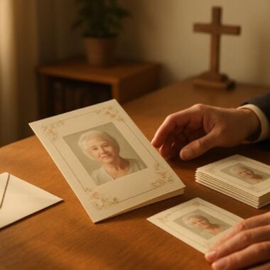
White is often seen as a traditional and timeless choice, symbolizing peace, purity, and reverence. Ivory, on the other hand, offers a softer, more vintage feel—perfect for those seeking a touch of warmth and gentleness. Pastel shades can bring a sense of subtle hope and celebration, especially for services that focus on a life well-lived or for younger individuals. Specialty colors, such as gentle blues or muted golds, can help highlight unique themes or personal touches.
It’s also important to consider how the color of the paper will interact with the other elements of your design. For example, certain ink or photo colors may look more vivid or subdued depending on the paper’s hue. At DisciplePress, we often guide families through these considerations, ensuring that their 8-page programs or tri-fold programs harmoniously blend paper color and design elements.
Another aspect to consider is the cultural or religious traditions that may influence color choices. Some faiths and communities have specific colors associated with mourning, remembrance, or celebration. If you’re uncertain, don’t hesitate to consult with spiritual leaders, funeral directors, or our custom design services team for thoughtful guidance.
Ultimately, the right paper color is the one that feels right for your family and honors your loved one’s spirit. This decision, while seemingly small, can have a profound impact on the way memories are cherished and shared.
Classic Choices: White and Ivory Paper for Funeral Programs
White and ivory are the most commonly chosen paper colors for funeral and memorial printing. Their popularity is rooted in their association with purity, simplicity, and timelessness, making them suitable for almost any type of service—religious, secular, or otherwise. Let’s explore why these colors remain steadfast favorites and how they can support your vision for a meaningful tribute.
White paper reflects light beautifully and provides a crisp backdrop for text, photos, and decorative elements. It’s particularly well-suited for funeral programs containing full-color photographs or intricate borders, as the contrast ensures clarity and readability. White is often chosen for folded memorial cards and prayer cards, giving them a classic, dignified appearance that’s universally appreciated.
Ivory paper brings a gentle warmth that can evoke nostalgia and comfort. It’s a wonderful choice for families seeking a softer, more personal atmosphere. Ivory pairs beautifully with sepia-toned or black-and-white photos and is often selected for booklet programs or 12-page programs dedicated to celebrating a long, rich life. The subtle creaminess of ivory paper can also make reading easier for older guests by reducing glare.
When deciding between white and ivory, consider the overall mood you wish to convey. White is ideal for formal, traditional ceremonies, while ivory lends itself well to services emphasizing warmth, heritage, or gentle remembrance. If you’re working within a tight timeline and require same-day printing, both colors are widely available and won’t delay your order.
If you’re uncertain which shade best suits your family’s wishes or your loved one’s personality, ordering paper samples or consulting with our team can provide peace of mind. At DisciplePress, we’re always available to help you compare options and make a choice that feels both respectful and meaningful.
Beyond Tradition: Using Pastel and Soft-Colored Papers
While white and ivory remain classic options, many families are drawn to pastel and soft-colored papers for their gentle beauty and the subtle emotions they evoke. Pastel shades—such as pale blue, lavender, soft pink, or gentle green—can convey hope, renewal, and a sense of personal connection. These hues are especially popular for celebration of life programs or services honoring children and young people.
Creating a meaningful tribute for your loved one is an important part of the healing process. We offer Prayer Cards, Memorial Cards and Celebration of Life to help you create meaningful tributes.
Choosing a pastel paper allows for personalization that reflects the spirit and preferences of your loved one. For example, soft blue might evoke tranquility and faith, while a delicate lavender could symbolize grace or spirituality. These colors can harmonize with angel or nature themes, especially in angel themed programs or nature themed programs, creating a unified and gentle design.
It’s helpful to consider how pastel paper will work with your chosen photos, artwork, or text. Darker ink colors or bold fonts tend to provide the best readability on lighter pastel backgrounds. If your program includes memorial cards or prayer cards, using matching pastel paper can create a cohesive set of keepsakes for guests to treasure.
Pastel paper can also be a comforting choice for families seeking to balance sadness with hope. These gentle shades can help lift the mood while honoring the solemnity of the occasion. For example, a tri-fold program printed on soft green paper might echo a favorite outdoors memory or a loved one’s favorite color, making the tribute deeply personal.
If you’re considering a pastel or soft-colored paper, be sure to request samples or view printed examples to ensure the color feels right. Our custom design services team is always available to offer recommendations and help you visualize how your chosen color will look in a finished program.
Specialty Papers and Unique Color Choices: When to Consider Them
For families seeking to create a truly distinctive memorial, specialty papers and unique color choices can add an extra layer of personalization to the funeral program. These options might include subtle metallics, textured finishes, or deeper hues such as slate blue, soft gold, or gentle taupe. Specialty papers are often chosen for milestone celebrations, faith-based services, or when honoring a loved one with a unique personality or life story.
Selecting a specialty paper can help convey a specific theme or reflect meaningful symbols. For example, a nature-loving individual might be honored with a nature themed program printed on a softly textured, earthy-toned paper. For faith-based services, gentle gold or pearlized paper can symbolize the promise of eternal life or the light of faith—elements often found in our faith-based programs.
It’s important to balance creativity with readability. While deep or bold colors can be striking, they may make text harder to read or affect how photos are displayed. Consider using specialty paper for covers, inserts, or memorial bookmarks rather than for the entire program. If you’re planning a multi-page program—like a 16-page program or 20-page program—alternating specialty paper with classic white or ivory can create a visually appealing effect.
Families who wish to use unique color choices should consult with a printing expert to discuss ink compatibility, durability, and how the final product will look under different lighting conditions. Our team at DisciplePress is happy to provide guidance, offer samples, and ensure your vision is achievable within your desired timeline and budget.
Specialty papers may require additional processing time, so if you need rush orders or have a limited window for completion, discuss these needs early in your planning process. We’re here to help you weigh the options and make a choice that feels both beautiful and practical.
Matching Paper Color to the Personality and Legacy of Your Loved One
One of the most meaningful ways to honor a loved one’s memory is to incorporate their personality, values, or passions into the details of the memorial service—including the color of the funeral program paper. Thoughtful selection of paper color can help guests feel your loved one’s presence and remember the unique life being celebrated.
Consider your loved one’s favorite colors, hobbies, or life milestones. Did they delight in gardening? A soft green or floral-themed program could be a gentle nod to their passion. Were they known for their joyful spirit? A pastel yellow or light blue might evoke fond memories. For those with deep faith, a gentle cream or gold may symbolize hope and spiritual light.
If you are creating multiple keepsakes, such as memorial cards, prayer cards, or memorial bookmarks, consider coordinating the paper color across all items to create a unified and thoughtful set. This small detail can be deeply comforting to guests, offering a tangible connection to the person you are honoring.
It’s also worth considering the mood you wish to set for the service. For example, a celebration of life program might use cheerful or uplifting colors to reflect a sense of hope and gratitude. For more traditional services, white or ivory may be preferred. Our custom design services can help you weave these personal touches into the layout and content of your program.
Ultimately, the most important thing is that your choice feels right for you and your family. Trust your instincts and don’t hesitate to ask for support if you need it. At DisciplePress, we’re honored to help families bring their unique visions to life, offering gentle guidance and practical expertise every step of the way.
Practical Factors: Readability, Printing, and Keepsake Value
While personal meaning is essential, there are also practical factors to consider when choosing the paper color for your funeral program. Readability is paramount—guests of all ages will be reading the program, sometimes in low-light settings. Lighter paper colors, such as white, ivory, and pastels, generally provide the best contrast for printed text and photographs.
Another important factor is print quality. Some specialty or colored papers may interact differently with ink, potentially altering the appearance of photos or making text less crisp. If your program includes detailed photographs or artwork, it’s best to request a proof or sample to ensure the final print meets your expectations. At DisciplePress, we offer guidance on selecting paper types that balance beauty with clarity, especially for 8-page programs and longer booklet programs.
Consider how the program will be used during and after the service. Many guests keep their funeral programs, memorial cards, or memorial bookmarks as cherished mementos. Choosing a durable, high-quality paper color ensures these keepsakes will last. Some families opt for slightly heavier stock or a textured finish for this reason, and our Paper Types Guide can help you explore the options.
If you’re working under a tight deadline, factor in availability and turnaround time. Classic colors like white and ivory are typically in stock and can be printed quickly, making them ideal for same-day printing or rush orders. Specialty colors, by contrast, may require additional lead time. Our team can help you balance your preferences with practical realities, ensuring your programs are ready when you need them.
Never hesitate to ask for recommendations or to view samples—seeing and touching the paper can make all the difference in your decision. We’re here to support you with compassionate, expert advice so you can focus on what matters most: honoring your loved one’s memory.
Coordinating Paper Color with Service Themes and Other Memorial Products
When planning a funeral or memorial service, many families find comfort in coordinating the various elements of the ceremony. Choosing a paper color that complements the overall theme—be it faith-based, nature-inspired, or a personalized celebration of life—can create a sense of harmony and intentionality. It also helps tie together related items such as memorial cards, prayer cards, and booklet programs.
If your service features a particular motif, such as angels, flowers, or scenic landscapes, selecting a paper color that echoes these themes can enhance the service’s emotional impact. For example, a soft sky blue or cloud white might be perfect for an angel themed program, while sage green or soft beige could be ideal for a nature themed program. Our Design Gallery offers inspiration for incorporating themes and coordinating colors.
Families who wish to provide guests with matching keepsakes—such as memorial bookmarks or memorial cards—can select a consistent paper color across all items. This not only creates a cohesive look but also reinforces the emotional resonance of the service. Consider extending your color theme to other details, such as the guest book, signage, or thank you cards, for a beautifully unified experience.
If you’re working with multiple contributors or planning a larger service, clear communication is key. Share your paper color choice with your funeral home, officiant, or anyone else involved in the planning. Our custom design services can help coordinate all printed materials, ensuring every detail aligns with your vision.
Remember, there is no single “right” way to coordinate colors. The most meaningful service is one that feels authentic to your loved one and offers comfort to those who gather in remembrance. We’re here to help you navigate these choices with empathy and care.
Navigating Uncertainty: Tips for Making Your Final Decision
Choosing the right paper color for a funeral program can feel daunting, especially when you’re also managing grief. It’s completely normal to feel uncertain or second-guess your choices. Here are some gentle suggestions to support you as you make this decision.
First, trust your instincts. Most families find that the color they are initially drawn to often resonates most deeply with their loved one’s spirit and the atmosphere they wish to create. If you’re unsure, gather feedback from close family members or friends who knew your loved one well.
Second, request samples or proofs whenever possible. Seeing and feeling the paper in person can provide clarity and reassurance. At DisciplePress, we’re happy to provide examples and walk you through the options, whether you’re considering a classic white bi-fold program or a pastel-colored tri-fold program.
Third, balance personal wishes with practical needs. If time is limited or you require same-day printing, classic colors may be the best choice. If your service has a particular theme or you wish to create a unique keepsake, specialty papers can add a meaningful touch. Our team is always available to help you weigh these considerations.
Finally, remember that there is no perfect choice—only the one that feels right for your family. Allow yourself grace and know that whatever you select will be a beautiful tribute to your loved one’s memory. We are honored to support you in this process and are always here to offer compassionate assistance.
Related Articles
Conclusion: Honoring Memory Through Thoughtful Paper Color Selection
Selecting the right paper color for a funeral program is a deeply personal decision, one that weaves together tradition, emotion, and the unique qualities of your loved one. Whether you choose classic white, gentle ivory, a soft pastel, or a specialty shade, your choice helps shape the experience of remembrance for everyone who attends.
Throughout this guide, we’ve explored how different paper colors evoke distinct emotions, support various themes, and create cherished keepsakes. We’ve also shared practical advice to help you balance readability, print quality, and turnaround time—ensuring your funeral programs, memorial cards, or memorial bookmarks truly honor your loved one.
As you move forward, remember that you don’t have to make these decisions alone. The team at DisciplePress is here to provide gentle expertise, whether you need rush orders, custom design services, or simply a listening ear. Our Paper Types Guide, Design Gallery, and online ordering resources are always available to make the process easier.
Above all, honor your feelings and trust that your thoughtful choices will help family and friends find comfort and connection during a difficult time. If you need guidance or support, please contact us—we are always here with compassion, understanding, and practical help.
May your memorial printing serve as a lasting, loving tribute—a gentle reminder of a life well-lived and the enduring power of memory.
Learn more about DisciplePress and our commitment to serving families. For personalized assistance, please contact us. We offer rush orders and same-day printing for urgent needs.